AI Poster Typography Guide: 6 Styles That Make Type the Hero
One word, six interpretations — type itself is a visual language
AI Poster Typography Guide: 6 Styles That Make Type the Hero
 One word, six interpretations — type itself is a visual language
In a feed full of noise, type is attention.
Think about the posters that actually stop your scroll: usually it's either one massive word punching through the frame, or a tagline that feels physically welded to the scene. No good type, no good poster — every brand designer agrees, and it's exactly where AI poster generation has historically fallen apart.
GPT Image 2's leap in text rendering is the first time AI can deliver complex layouts "as specced." This post pulls together 6 type-driven prompts curated from the GitHub community (awesome-gpt-image-2, awesome-gpt-image) — covering surreal, classical, info-dense, retro, fashion, and futuristic moods. Each one comes with reusable techniques you can lift today.
Style 1: Oversized Perspective Type — Painting Words Into the Scene
Stop letting type "float" on top of an image. Make it physically belong to the scene.
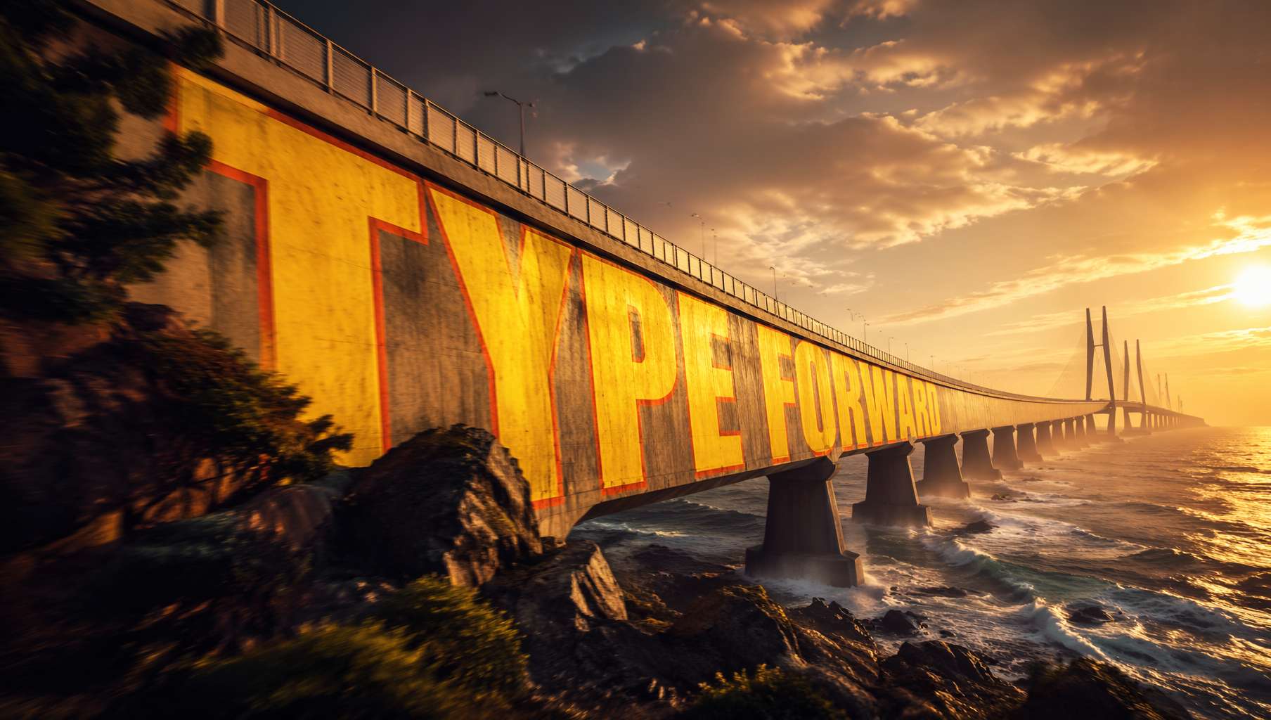 Giant letters painted across a sea-crossing bridge, bending with the deck's curvature — pure cinematic poster energy. Prompt by @xpg0970
Community prompt (@xpg0970):
Scene: Side view of a cross-sea bridge, dramatic cinematic angle. Giant bold sans-serif text "[text]" painted onto the surface of the bridge, progressively foreshortened from near to far end, letterforms conforming to surface curvature, surface-integrated not floating. Text partially occluded by foreground elements, creating depth-layering effect. Oversized bright yellow + sharp orange outline, extreme perspective distortion aligned to vanishing point. Cinematic lighting, motion blur, poster-grade dynamic integrated typography, modern advertising aesthetics.
Key techniques:
letterforms conforming to surface curvature— letters bend with the surface instead of sitting flat on topsurface-integrated not floating— fused with the surface, not hovering above itextreme perspective distortion aligned to vanishing point— aggressive perspective collapsing toward the vanishing pointpartially occluded by foreground elements— foreground objects break the type, creating spatial depth
Where it shines: film posters, sportswear ads, city campaign visuals.
Style 2: Chinese Calligraphy Manuscript — AI Channels a Thousand Years of Brushwork
GPT Image 2's grasp of Chinese calligraphy has jumped a generation, making "recreating a classical manuscript" actually viable.
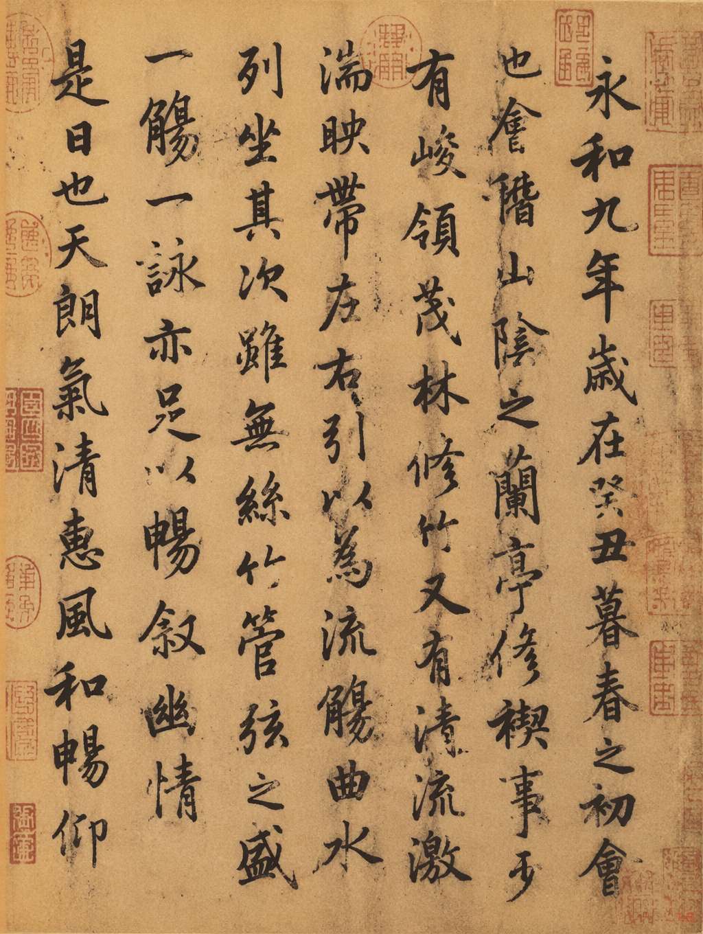 Manuscript in the style of the Lanting Xu, Wang Xizhi's flowing semi-cursive on aged xuan paper with vermilion seals. Prompt by @MrLarus
Community prompt (@MrLarus):
Generate an image of the authentic manuscript of [classic text title], and incorporate the emotional core of the work into the calligraphy.
Going further — stack on style modifiers:
in Wang Xizhi style— Wang Xizhi (airy, semi-cursive)in Yan Zhenqing style— Yan Zhenqing (bold, regular script)with stronger emotional expression— heighten the emotional chargeon aged xuan rice paper with red seal stamps— aged xuan paper with vermilion seals
Key techniques:
- Use the work's title as an emotional cue — the model pours the piece's mood into the strokes
- Calling out the medium (xuan paper, silk, bamboo slips) massively boosts authenticity
- Adding seals, colophons, and ink bleeds makes it feel like a real antique
Where it shines: cultural brands, heritage products, museum posters, wuxia/period game art.
Style 3: Information-Dense Posters — Calligraphy + Diagrams + Symbols
The most demanding typography use case there is: tons of small text, symmetrical layout, symbolic vocabulary.
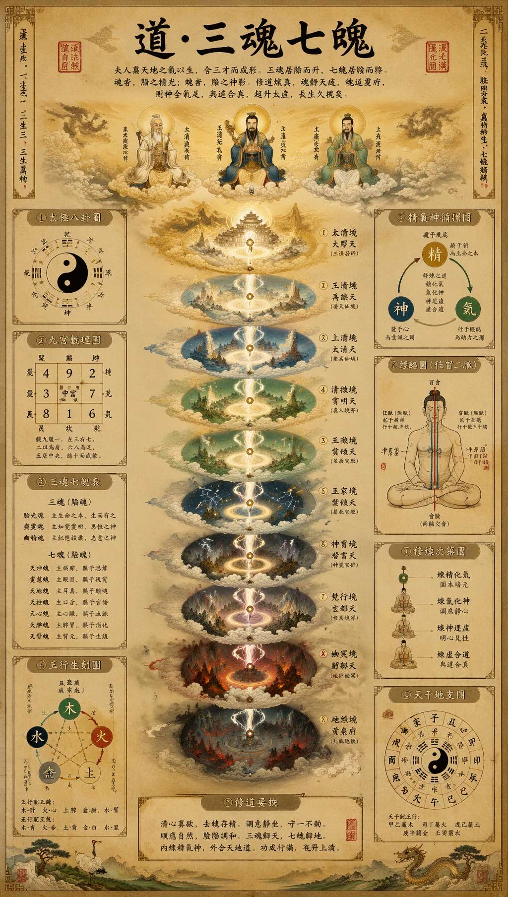 Daoist manuscript-style infographic: brush calligraphy headline, multi-tier diagrams, classical annotations, vermilion seals. Prompt by @leyu37829
Community prompt (@leyu37829, excerpt):
A highly detailed vertical Taoist esoteric infographic poster in the style of an ancient Chinese religious scroll, printed on aged beige rice paper. At the top center, large black brush-calligraphy title text reads "道·三魂七魄". The composition is perfectly symmetrical and centered on a glowing vertical spiritual axis. Around the central column, include 9 labeled side panels and diagrams in traditional Chinese layout: bagua, yin-yang, soul lists, five-elements diagram, essence-qi-spirit cycle, meridian body diagram. Use many small Chinese labels throughout, with classical seal stamps in red. Museum-quality Daoist metaphysical chart, ultra intricate, hand-painted gongbi plus ink wash illustration.
Key techniques:
perfectly symmetrical, centered on a vertical axis— central-axis symmetry for that ritual feel9 labeled side panels and diagrams— specify an exact count and the model lays it out accordinglyUse many small Chinese labels throughout— forces dense annotationclassical seal stamps in red— red seals act as visual anchors
Where it shines: knowledge-creator infographics, cultural explainers, Pinterest long-form pins, museum exhibition collateral.
Style 4: Retro Propaganda Type — The Power of Red and Gold
Eighties propaganda type is back: chunky, fervent, loaded with ideological visual memory.
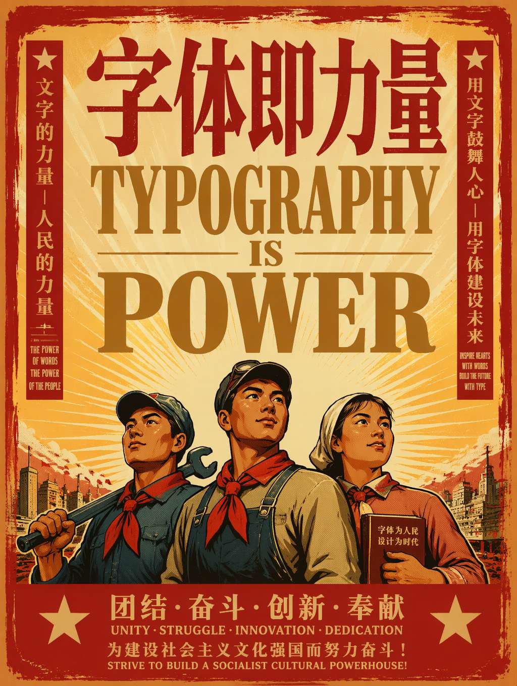 "Type as power" — heavy red-and-gold serifs, worker-hero figures, sunburst rays. The classic retro propaganda recipe. Prompt adapted from @akokoi1
Community prompt template (@akokoi1):
Generate a 1980s propaganda poster. Use the exact slogan "[your slogan here]". Include [characters], and give [character] a [accessory].
Key techniques:
1980s propaganda poster— one phrase locks down the entire visual systemUse the exact slogan— pin the exact text (where GPT Image 2's text rendering really pays off)- Add specific characters and props for a story beat
- Palette: red lead, gold accent, cream ground (red-yellow-black is the 1980s signature)
Variants to try:
- Soviet constructivist: swap in
Soviet constructivist poster - Chinese revolutionary: append
Chinese revolutionary poster aesthetic - Bauhaus type: try
1920s Bauhaus poster, geometric sans-serif
Where it shines: nostalgia-themed campaigns, retro-revival brands, pop-art merch, Gen Z throwback content.
Style 5: Editorial Display Type — Fashion's Type-First Aesthetic
The current move in fashion and streetwear advertising: let typography upstage the model and the product.
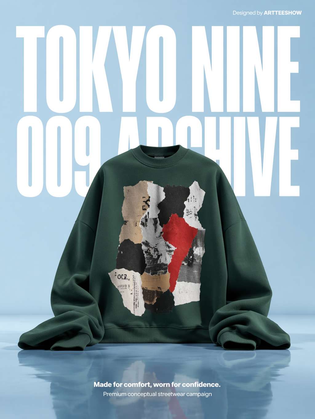 Oversized white condensed sans-serif as the backdrop, a green hoodie posed like a sculpture in front — the magazine-style streetwear playbook. Prompt by @_LaurentB
Community prompt (@_LaurentB, excerpt):
A clean editorial fashion advertisement poster on a pale powder-blue studio background with a glossy reflective floor. The composition is vertical and minimal, dominated by oversized bold white condensed sans-serif typography in the background reading "TOKYO NINE" on the top line and "009 ARCHIVE" below, filling most of the upper half behind the subject. Centered in the lower middle is an oversized [product]. Premium conceptual streetwear campaign aesthetic, crisp studio lighting, surreal scale contrast.
Key techniques:
dominated by oversized bold condensed sans-serif typography— let type overpower everything elsecondensed sans-serif— the soul of editorial type (tall and narrow)filling most of the upper half behind the subject— type lives in the background but rules the framesurreal scale contrast— surreal scale gap between type and product
Type terminology cheat-sheet:
condensed sans-serif— tall and narrowexpanded sans-serif— short and widedisplay serif— large headline serifslab serif— heavy, grounded slabsgeometric sans— minimal, rationalist geometry
Where it shines: streetwear hero shots, fashion e-commerce, athletic brands, lookbooks, street-style magazines.
Style 6: Modern Double-Exposure Posters — High-End City and Brand Storytelling
Fusing type with imagery via "ribbons of light" or double exposure is the most-loved high-end poster format right now.
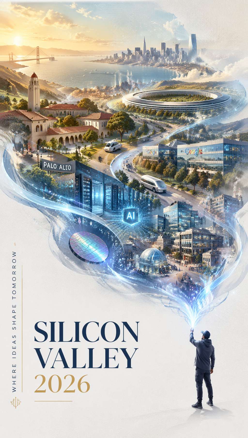 A silver-blue ribbon of light streams across the frame, morphing into a Silicon Valley skyline — capped off by elegant "SILICON VALLEY 2026" typography. Prompt by @carsonyungos
Community prompt (@carsonyungos, excerpt):
A refined city promotional poster with a futuristic yet elegant atmosphere. Double exposure composition, preserving an S-shaped sense of flowing movement. On a pure white textured background, a miniature figure releases a long ribbon of luminous silver-blue light. The ribbon flows gracefully through the air, and as it drifts, it magically transforms into a grand landscape blending [city elements]. In the lower-left corner, elegant typography reads "[CITY NAME 2026]" with a vertical promotional slogan: "[your slogan]". Beautiful editorial layout, graceful spacing, clear and complete lettering, premium city branding poster, cinematic lighting.
Key techniques:
Double exposure composition— double exposure layering (light ribbon plus landscape)S-shaped sense of flowing movement— S-curve composition gives the frame its rhythmelegant typography in the lower-left corner— type retreats to the corner, refined and unobtrusiveclear and complete lettering— keeps lettering crisp and avoids missing-glyph artifacts
Swappable variables:
- City:
Silicon Valley→Tokyo/Shanghai/New York - Theme:
technology and innovation→art and culture/nature and wellness - Tone:
silver-blue→gold-amber/rose-pink
Where it shines: city tourism campaigns, brand annual report covers, tech-company key visuals, luxury brand posters.
A Universal Typography Prompt Template
Abstract the six styles above and you get a reusable scaffold:
[风格定位] poster with [整体氛围].
[构图方式] composition with [关键视觉机制].
[Background description].
TYPOGRAPHY: [字体类型] reading "[exact text]",
positioned [位置描述], with [字体处理方式like distortion/material/color].
SUBJECT: [次要主体描述].
COLORS: [主色] + [辅色], [整体色调风格].
STYLE: [风格关键词], [质感关键词], [完成度关键词].
Type-treatment keyword cheat-sheet:
| The effect you want | Prompt keyword |
|---|---|
| Type bends with the surface | letterforms conforming to surface curvature |
| Type physically baked into the scene | surface-integrated not floating |
| Type dominates as background | dominated by oversized typography in the background |
| Material-textured letters | letters constructed from [material] texture |
| Letters partially blocked for depth | partially occluded by foreground elements |
| Extreme vanishing-point perspective | extreme perspective distortion aligned to vanishing point |
| Type fused with imagery | double exposure composition |
| Type as the lead subject | typography as the hero element of the composition |
Wrap-Up
When does AI-generated type-driven poster work pay off the most?
- Concept exploration: test five directions in three minutes to find a brand angle
- Budget-conscious startups: no money for a designer-led key visual? Ship a v1 with AI
- Daily social posting: one themed poster a day, ten times faster than hand-laying it out
- Designer co-pilot: generate layout inspiration with AI, then refine in Figma or Photoshop
When NOT to use AI:
- Core VI for a major brand (still needs a real type designer)
- Commercial work tangled up in licensed-font legalities
- Print collateral above A2 (AI output resolution caps out)
But for content creators, indie designers, and early-stage teams, AI typography posters are the fastest "concept-to-finished-piece" pipeline available right now. Bookmark these six prompts, drop them in whenever you need a poster, and let GPT Image 2 handle the rest.
Prompt sources
- EvoLinkAI Prompt Library — daily-updated poster cases
- awesome-gpt-image — trending typography prompts from X
Written with pixocto · Images generated by GPT Image 2