GPT Image 2 Logo Design Guide: Create Brand Logos with Zero Design Skills
9 different AI-generated logo styles — minimalist wordmark, geometric icon, vintage badge, mascot… all from a single prompt each
GPT Image 2 Logo Design Guide: Create Brand Logos with Zero Design Skills
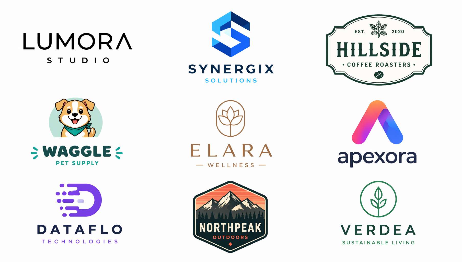 9 different AI-generated logo styles — minimalist wordmark, geometric icon, vintage badge, mascot… all from a single prompt each
You need a logo from day one of starting a business.
Register a company — need a logo. Print business cards — need a logo. Open an online store — need a logo. Announce your brand on social media — need a logo. Hiring a designer for a full brand identity starts at thousands of dollars, plus revision fees. DIY with Canva? Always looks a bit off.
GPT Image 2 offers another path: describe your brand's personality in one sentence, and see the logo instantly.
To be clear — AI-generated logos can't be directly registered as trademarks, and they're not in vector format. But they help you do something crucial: figure out what you actually want before spending money on a designer. Instead of vaguely saying "I want something premium and modern," you can show the designer "I want this style, this color scheme, this typeface." Handing over an AI mockup improves communication efficiency 10x.
1. Four Major Logo Types + Prompt Templates
Wordmark
The most classic logo type. Google, Coca-Cola, Supreme — the brand name itself is the logo. Best for short, recognizable brand names.
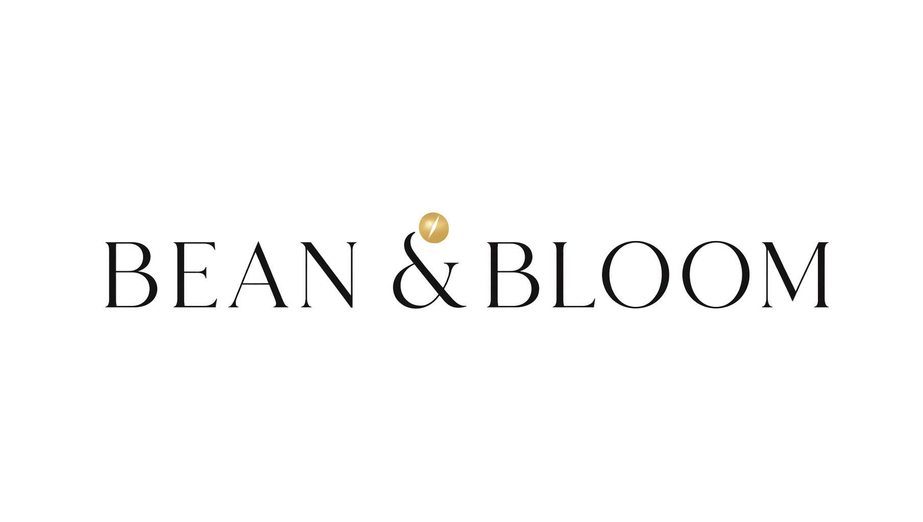 Coffee brand wordmark — BEAN & BLOOM, thin serif + gold coffee bean accent, minimal elegance
Prompt Template — Wordmark Logo:
A minimalist [industry] brand wordmark logo on [background color] background. The text "[brand name]" in [font style: elegant thin serif / bold sans-serif / playful rounded / vintage slab-serif] typography, [color description] letters [optional: with a small [icon] icon as accent]. Clean vector style, professional logo design, centered composition, photorealistic, high quality, 16:9 composition.
Actual example (prompt used for the image above):
A minimalist coffee brand wordmark logo on white background. The text BEAN & BLOOM in elegant thin serif typography, matte black letters with a single small gold coffee bean icon dotting the ampersand. Clean vector style, professional logo design, centered composition, photorealistic, high quality, 16:9 composition.
Key tips:
on white background/on dark backgroundsets the tonal foundation- Font styles are more precise in English:
thin serif,bold sans-serif,rounded - Adding a small accent icon (
a small icon as accent) keeps pure wordmarks from looking flat clean vector stylepushes the output toward that flat, logo-like quality
Icon / Symbol
Apple's apple, Nike's swoosh, Twitter's bird — one shape represents the entire brand. Best for brands aiming for high recognition and global reach.
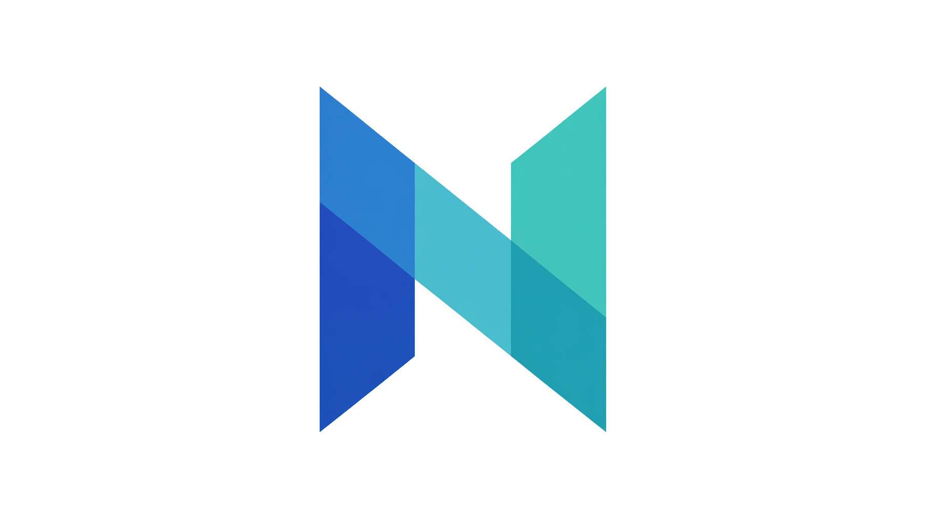 Tech startup icon — overlapping translucent triangles forming abstract letter N, blue-teal gradient, Silicon Valley aesthetic
Prompt Template — Icon Logo:
A modern [industry] icon logo on [background color] background. [Shape description: abstract geometric shape / stylized animal silhouette / minimalist line art symbol] in [color/gradient: gradient blue and teal / solid black / monochrome gold]. [Style: flat design with clean edges / line art with uniform stroke / 3D glossy]. No text, professional logo design, centered, photorealistic, high quality, 16:9 composition.
Icon direction by industry:
| Industry | Suitable shapes |
|---|---|
| Tech | Abstract geometry, pixels, circuit lines |
| Food & Beverage | Utensils, ingredient silhouettes, steam |
| Education | Books, lightbulbs, owls |
| Fitness | Human silhouettes, mountains, lightning |
| Eco / Green | Leaves, water drops, globe |
| Finance | Shields, columns, rising arrows |
Badge / Emblem
The favorite of breweries, coffee shops, and outdoor brands. Vintage, weighty, story-rich.
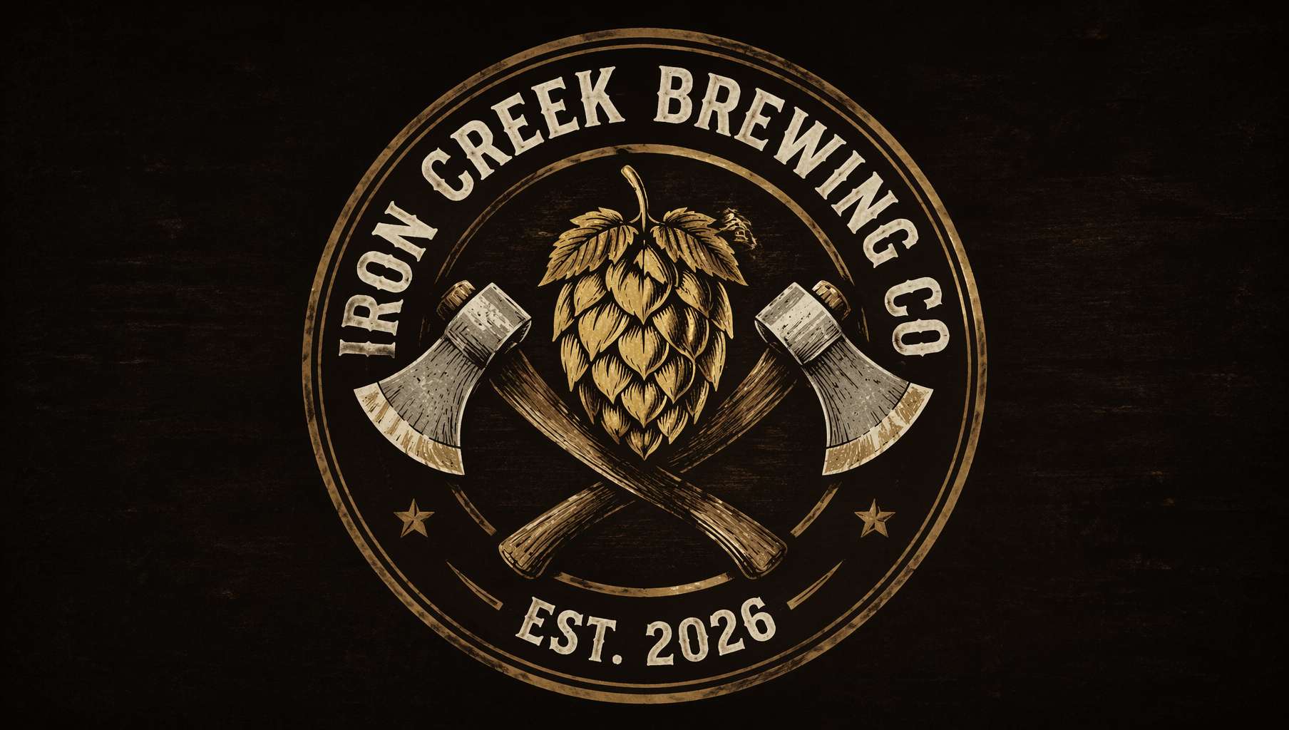 Craft brewery badge — IRON CREEK BREWING CO., circular emblem, hop cone + crossed axes, distressed texture
Prompt Template — Badge Logo:
A vintage [industry] badge logo on [background color] background. [Shape: circular / shield-shaped / ribbon banner] emblem with "[brand name]" text arched around the [position: top / perimeter], "[subtext: EST. 2026 / PREMIUM QUALITY]" at the bottom, [center motif description] in the center. [Texture: weathered distressed texture / clean engraved lines / hand-drawn illustration feel], [color scheme] colors, [style] style, professional logo design, centered, photorealistic, high quality, 16:9 composition.
Badge style keywords:
vintage Americana— American retro, suits breweries, outdoor, westernArt Deco— Decorative arts, suits bars, luxury, hotelsnautical— Maritime, suits seafood, sailing, coastal brandsheritage / old English— Traditional British, suits tea, bespoke tailoringhand-drawn rustic— Handcrafted feel, suits farms, organic food
Mascot
Turn your brand into a character with personality. KFC's Colonel, Duolingo's owl, Reddit's Snoo — mascots make brands feel human.
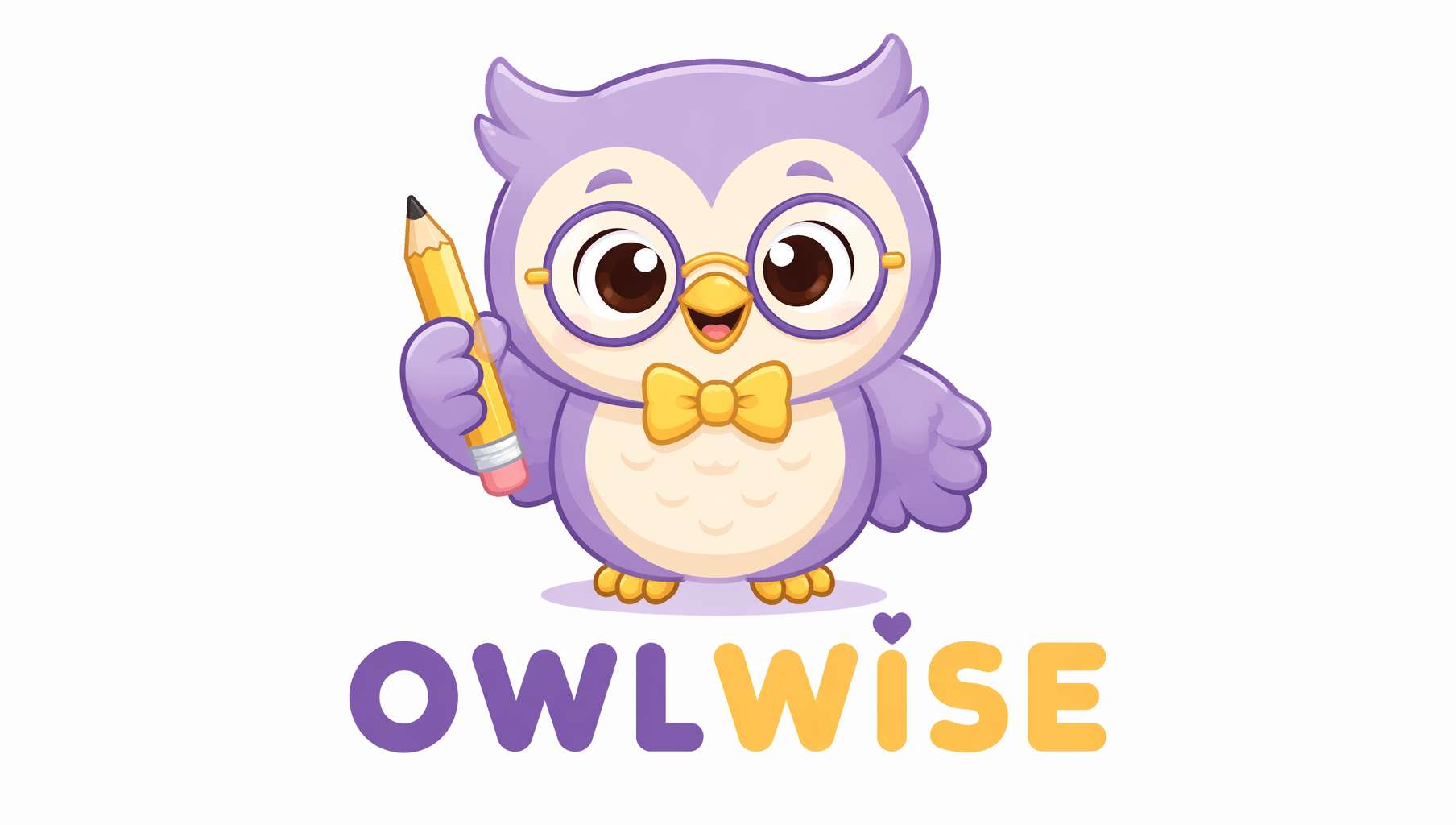 Children's education mascot — bespectacled owl with pencil, soft purple-yellow palette, rounded and friendly
Prompt Template — Mascot Logo:
A cute mascot logo for a [industry/product] on [background color] background. A [character description: friendly round owl / smiling fox / playful robot] [action/accessory: wearing glasses and holding a pencil / carrying a coffee cup / giving a thumbs up], [color scheme] color scheme, [style: kawaii style with simple clean lines / cartoon style with bold outlines / flat design with geometric shapes]. Playful and approachable, the text "[brand name]" below in [font] font, professional mascot logo design, centered, photorealistic, high quality, 16:9 composition.
Mascot design principles:
- Keep the character simplified: fewer details = higher recognition (think Twitter's bird)
- Use
kawaiifor cute,bold outlinesfor cartoon - Give the character an action or prop for personality
playful and approachablekeeps the tone friendly without being childish
2. Style Control: Same Brand Name, Different Personalities
Same brand name, different keywords — completely different vibes. This is AI's real value: rapidly seeing different directions.
| Style | Core keywords | Best for |
|---|---|---|
| Minimalist | minimalist, clean lines, flat design, monochrome | Tech, SaaS, consulting |
| Vintage | vintage, retro, distressed texture, sepia tones | Coffee, beer, barbershops |
| Geometric | geometric, abstract, sharp angles, symmetrical | Architecture, fashion, finance |
| Hand-drawn | hand-drawn, sketch style, organic lines, illustrated | Bakeries, florists, children's |
| Gradient | gradient, vibrant colors, modern, dynamic | Internet, social, gaming |
| Luxury | luxury, gold foil, elegant serif, premium | Jewelry, hotels, fine dining |
| Pixel | pixel art, 8-bit, retro gaming, blocky | Gaming, Web3, streetwear |
Quick test prompt — just swap the style word:
A [style] logo for a brand called "[brand name]" on white background. [Style-matching description]. Professional logo design, centered, photorealistic, high quality, 16:9 composition.
3. Precise Color & Typography Control
Color specification
Don't just write blue — be specific:
| Desired effect | How to write it |
|---|---|
| Deep navy | deep navy blue (#1B2A4A) |
| Tiffany blue | robin egg blue, Tiffany-style cyan |
| Morandi tones | muted dusty rose and sage green, Morandi palette |
| Black & gold | matte black with metallic gold accents |
| Gradient | gradient from coral pink to warm orange |
Font style specification
| Desired feel | Keywords |
|---|---|
| High-end editorial | elegant thin serif, like Didot or Bodoni |
| Tech modern | clean geometric sans-serif, like Futura or Montserrat |
| Handwritten warmth | handwritten script, casual brush lettering |
| Vintage typewriter | monospaced typewriter font, vintage slab-serif |
| Soft friendly | rounded sans-serif, soft and approachable |
| Powerful bold | bold condensed sans-serif, strong and impactful |
Combo example:
The text "AURORA" in elegant thin serif typography similar to Didot, gradient from coral pink to warm orange, on a clean white background.
4. Brand Application Mockups: See Your Logo in the Real World
After generating a logo, the most important step is seeing how it looks in real contexts. Is it legible small on a business card? Does it hold up large on a sign? What colors complement it on packaging?
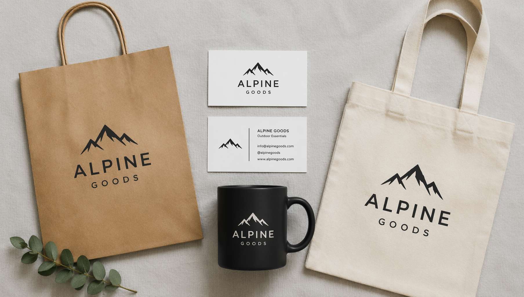 Brand application mockup — same logo on business cards, shopping bag, coffee mug, and tote bag, visually cohesive
Prompt Template — Brand Application Mockup:
A flat-lay brand identity mockup on a [surface] surface. A [logo description] logo printed on: [item list: two white business cards, a kraft paper shopping bag, a black matte coffee mug, and a cream tote bag]. All items arranged in an organized flat-lay composition. Soft overhead studio lighting, brand presentation style, photorealistic, high quality, 16:9 composition.
Mockup item combos by industry:
| Industry | Recommended items |
|---|---|
| Coffee/F&B | Paper cups, paper bags, aprons, menus |
| Tech/SaaS | Laptop screen, phone screen, T-shirt |
| Fashion | Hang tags, shopping bags, packaging boxes, ribbons |
| Beauty | Bottles, packaging boxes, shopping bags, gift sets |
| Education | Notebook covers, folders, pencils, stickers |
Prompt Template — Single Item Mockup:
A photorealistic mockup of a [item: matte black coffee cup / white business card / kraft paper bag] with a [logo description] logo printed on it. [Scene: sitting on a wooden cafe table / held in hand / on a marble countertop]. Soft natural lighting, shallow depth of field, product photography style, photorealistic, high quality, 16:9 composition.
5. Logo Design Pitfalls to Avoid
AI-generated logos look great, but there are a few steps between "pretty image" and "actually usable":
❶ Can't directly register as trademark
AI-generated images may resemble existing trademarks, and copyright law around AI-generated works varies by jurisdiction. AI for concepts, human designer for finals is the safest workflow.
❷ Not vector format
GPT Image 2 outputs raster images (PNG) — they blur when scaled up. Real logos need vector format (SVG/AI).
Solutions:
- Use the image trace / vectorize function in design software (Illustrator, Figma, Inkscape, etc.)
- Or hand the AI mockup to a designer as reference to redraw as vectors
❸ Details may be imperfect
AI sometimes produces misspelled text, imperfect symmetry, or uneven lines. These need human correction in the final design.
❹ Recommended workflow
Idea → GPT Image 2 generates 5-10 directions → Filter to 2-3 favorites → Hand to designer for refinement + vectorization → Trademark search → Registration
This workflow is much faster and cheaper than the traditional "designer guesses what you want → 10 rounds of revisions."
6. Logo Prompt Cheat Sheet
| Logo Type | Core prompt fragments | Don't forget |
|---|---|---|
| Wordmark | wordmark logo, "[brand name]" in [font] typography, clean vector style | Background color + accent icon |
| Icon | icon logo, [shape description], no text, flat design | Industry-relevant shape direction |
| Badge | badge logo, [shape] emblem, "[brand name]" arched, [center motif] | Distressed texture + subtext (EST. year) |
| Mascot | mascot logo, [character], [action], [style], "[brand name]" below | Color scheme + friendly tone words |
| Brand Mockup | brand identity mockup, logo printed on [item list], flat-lay | Industry-matched item combo |
Universal suffix:
professional logo design, centered, photorealistic, high quality, 16:9 composition
For square logos (avatars / app icons):
professional logo design, centered, photorealistic, high quality, 1:1 square composition
Final Thoughts
GPT Image 2 doesn't replace hiring a designer — it helps you figure out what you want before you hire one.
The old pain point: you can't articulate what you want, so the designer has to guess. The new workflow: you run 10 directions with AI, pick the closest one, and tell the designer "this vibe." Communication cost drops from 10 revision rounds to 1-2 rounds of precise alignment.
Try it: open ChatGPT, type your brand name and industry, and start with a wordmark — it's usually the easiest type to get good results from.
Resources
- Awesome GPT Image 2 API Prompts — Prompt collection organized by scenario
- EvoLinkAI Prompt Library — Updated daily, includes brand design templates
- awesome-gpt-image — Curated prompts from top creators on X
- OpenAI Official Prompting Guide
Written with pixocto · Images generated by GPT Image 2