AI 海報字體設計指南:6 種讓字體成為視覺主角的風格
同一個詞,不同字體的演繹——字體本身就是一種視覺語言
AI 海報字體設計指南:6 種讓字體成為視覺主角的風格
 同一個詞,不同字體的演繹——字體本身就是一種視覺語言
在資訊流裡,字體就是注意力。
滑過那些讓你停下手指的海報:要麼是一個超大穿透畫面的字體,要麼是一組與場景融為一體的標語。沒有好字體,就沒有好海報——這是品牌設計師的共識,也是 AI 海報生成最容易翻車的地方。
GPT Image 2 在文字渲染上的突破,讓 AI 第一次能夠「按設計稿要求」準確輸出複雜排版。本文從 GitHub 社群精選了 6 個字體主導的提示詞(awesome-gpt-image-2、awesome-gpt-image),涵蓋超現實、古典、資訊密集、復古、時尚、未來六種調性,每一種都有清晰可複用的技巧。
風格 1:超大透視字體——把字「刷」進場景裡
讓字體不再「飄」在畫面上,而是與場景物理融合。
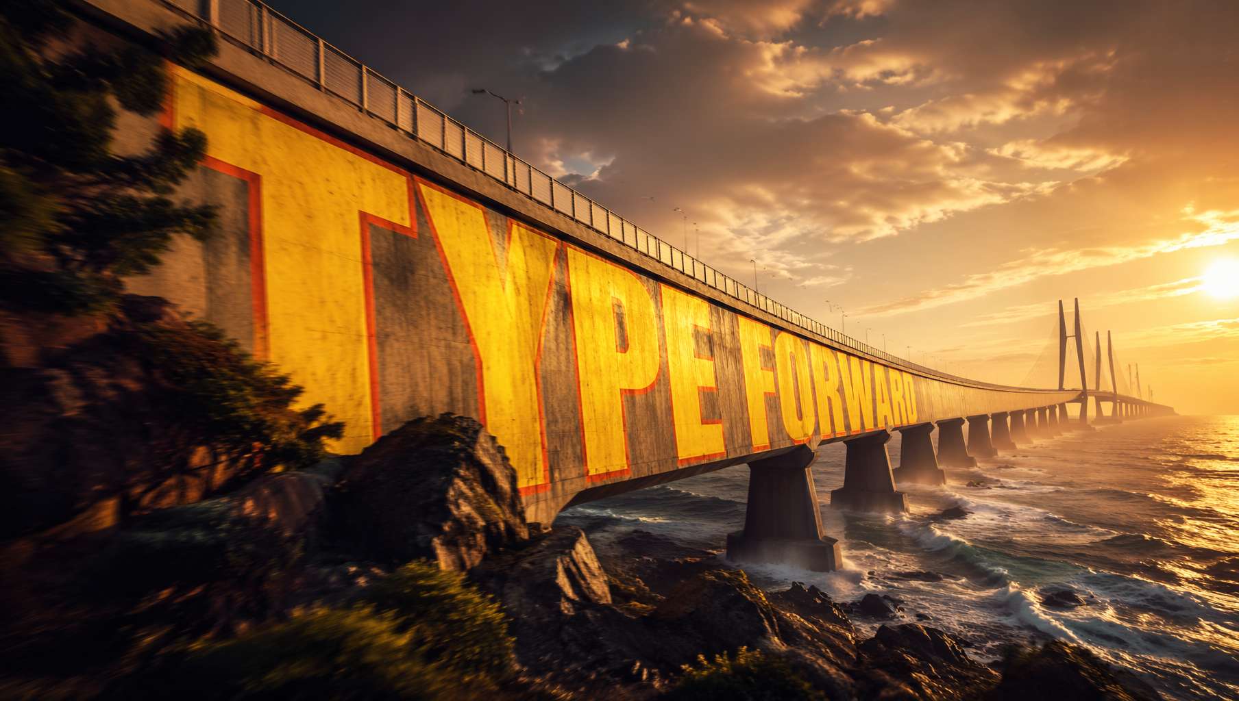 跨海大橋上的超大刷字,跟著橋面的曲率自然變形——電影海報的視覺衝擊力。提示詞來自 @xpg0970
社群提示詞(@xpg0970):
Scene: Side view of a cross-sea bridge, dramatic cinematic angle. Giant bold sans-serif text "[text]" painted onto the surface of the bridge, progressively foreshortened from near to far end, letterforms conforming to surface curvature, surface-integrated not floating. Text partially occluded by foreground elements, creating depth-layering effect. Oversized bright yellow + sharp orange outline, extreme perspective distortion aligned to vanishing point. Cinematic lighting, motion blur, poster-grade dynamic integrated typography, modern advertising aesthetics.
關鍵技巧:
letterforms conforming to surface curvature—— 字母跟著表面曲率變形,不是平貼上去surface-integrated not floating—— 與表面融為一體,不是漂浮在表面extreme perspective distortion aligned to vanishing point—— 極端透視,向消失點收縮partially occluded by foreground elements—— 被前景遮擋,營造空間層次
適用場景:電影海報、運動品牌廣告、城市宣傳片視覺
風格 2:中文書法手稿——AI 還原千年筆意
GPT Image 2 對中文書法的理解突飛猛進,「還原經典手稿」成了可能。
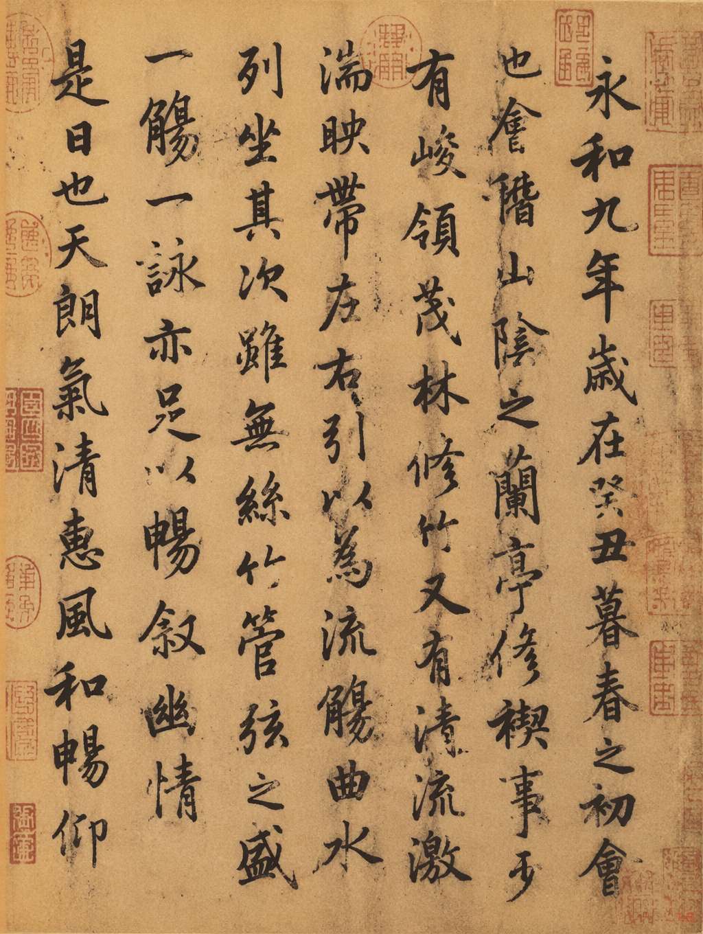 《蘭亭集序》風格手稿,王羲之行書筆意,黃褐宣紙 + 朱紅印章。提示詞來自 @MrLarus
社群提示詞(@MrLarus):
Generate an image of the authentic manuscript of [classic text title], and incorporate the emotional core of the work into the calligraphy.
進階用法——附加風格指引:
in Wang Xizhi style—— 王羲之風格(行書飄逸)in Yan Zhenqing style—— 顏真卿風格(楷書雄渾)with stronger emotional expression—— 加強情感表達on aged xuan rice paper with red seal stamps—— 黃褐宣紙 + 朱紅印章
關鍵技巧:
- 把作品名當作「風格情緒」的提示——AI 會把作品的情感注入字跡
- 強調載體(宣紙 / 絹本 / 竹簡)能大幅提升真實感
- 加入「印章 / 題跋 / 墨漬」細節讓畫面更像古董
適用場景:文化品牌、文創產品、博物館海報、古風遊戲配圖
風格 3:資訊密集型海報——書法 + 圖表 + 符號
最考驗排版能力的一種字體應用——大量小字、對稱布局、符號語言。
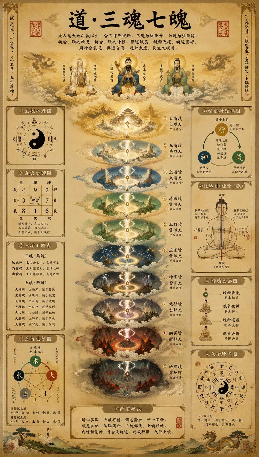 道教手稿風格的資訊海報:書法標題 + 多層級圖表 + 古文字註釋 + 朱紅印章。提示詞來自 @leyu37829
社群提示詞(@leyu37829,節錄):
A highly detailed vertical Taoist esoteric infographic poster in the style of an ancient Chinese religious scroll, printed on aged beige rice paper. At the top center, large black brush-calligraphy title text reads "道·三魂七魄". The composition is perfectly symmetrical and centered on a glowing vertical spiritual axis. Around the central column, include 9 labeled side panels and diagrams in traditional Chinese layout: bagua, yin-yang, soul lists, five-elements diagram, essence-qi-spirit cycle, meridian body diagram. Use many small Chinese labels throughout, with classical seal stamps in red. Museum-quality Daoist metaphysical chart, ultra intricate, hand-painted gongbi plus ink wash illustration.
關鍵技巧:
perfectly symmetrical, centered on a vertical axis—— 中軸對稱,宗教儀式感9 labeled side panels and diagrams—— 明確指定數量,AI 會按數量布局Use many small Chinese labels throughout—— 強制要求大量小字註釋classical seal stamps in red—— 紅色印章作為視覺錨點
適用場景:知識型部落客資訊卡、文化科普海報、Pinterest 長圖、博物館展覽物料
風格 4:復古宣傳海報字體——紅金雙色的力量感
1980 年代復古字體回潮——粗獷、熱血、帶強烈意識形態視覺記憶。
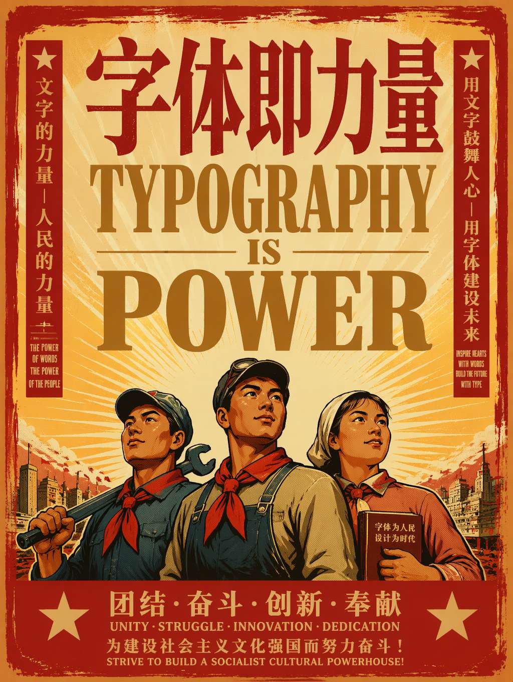 「字體即力量」——粗獷的紅金襯線大字 + 工人英雄人物 + 太陽光芒。復古宣傳海報的標準配方。提示詞改編自 @akokoi1
社群提示詞範本(@akokoi1):
Generate a 1980s propaganda poster. Use the exact slogan "[your slogan here]". Include [characters], and give [character] a [accessory].
關鍵技巧:
1980s propaganda poster—— 一個詞鎖定整個視覺系統Use the exact slogan—— 精確指定字體內容(GPT Image 2 文字渲染優勢)- 加入具體人物 + 配飾增加敘事性
- 配色:紅色為主、金色輔助、米黃底(紅黃黑配色是 1980s 海報標誌)
變體方向:
- 蘇聯構成主義風格:換成
Soviet constructivist poster - 中國革命海報風格:加
Chinese revolutionary poster aesthetic - 包浩斯字體風格:換成
1920s Bauhaus poster, geometric sans-serif
適用場景:懷舊主題行銷、復古風潮品牌、普普藝術周邊、Z 世代復古內容
風格 5:雜誌編輯大字體——時尚廣告的字體主導美學
時尚和潮牌廣告的最新趨勢:讓字體壓過模特和產品成為主角。
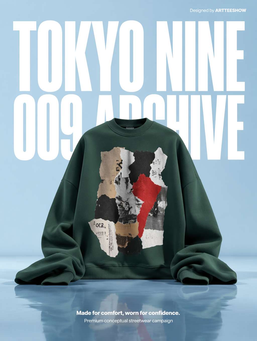 超大白色壓縮無襯線字體作為背景,綠色帽 T 作為雕塑式主體——雜誌風潮牌廣告的標準範式。提示詞來自 @_LaurentB
社群提示詞(@_LaurentB,節錄):
A clean editorial fashion advertisement poster on a pale powder-blue studio background with a glossy reflective floor. The composition is vertical and minimal, dominated by oversized bold white condensed sans-serif typography in the background reading "TOKYO NINE" on the top line and "009 ARCHIVE" below, filling most of the upper half behind the subject. Centered in the lower middle is an oversized [product]. Premium conceptual streetwear campaign aesthetic, crisp studio lighting, surreal scale contrast.
關鍵技巧:
dominated by oversized bold condensed sans-serif typography—— 讓字體壓過其他元素condensed sans-serif—— 壓縮無襯線(編輯風字體的靈魂)filling most of the upper half behind the subject—— 字體作為背景但占據主導surreal scale contrast—— 字體與產品的超現實尺寸對比
字體術語速查:
condensed sans-serif= 壓縮無襯線(窄高型)expanded sans-serif= 拓寬無襯線(矮寬型)display serif= 展示型襯線(標題大字)slab serif= 厚襯線(厚重穩重)geometric sans= 幾何無襯線(極簡理性)
適用場景:潮牌主圖、時尚電商、運動品牌、Lookbook、街拍雜誌
風格 6:現代雙重曝光海報——城市/品牌的高級表達
把字體和圖形透過「光帶 / 雙重曝光」融合,是當下最受歡迎的高端品牌海報形式。
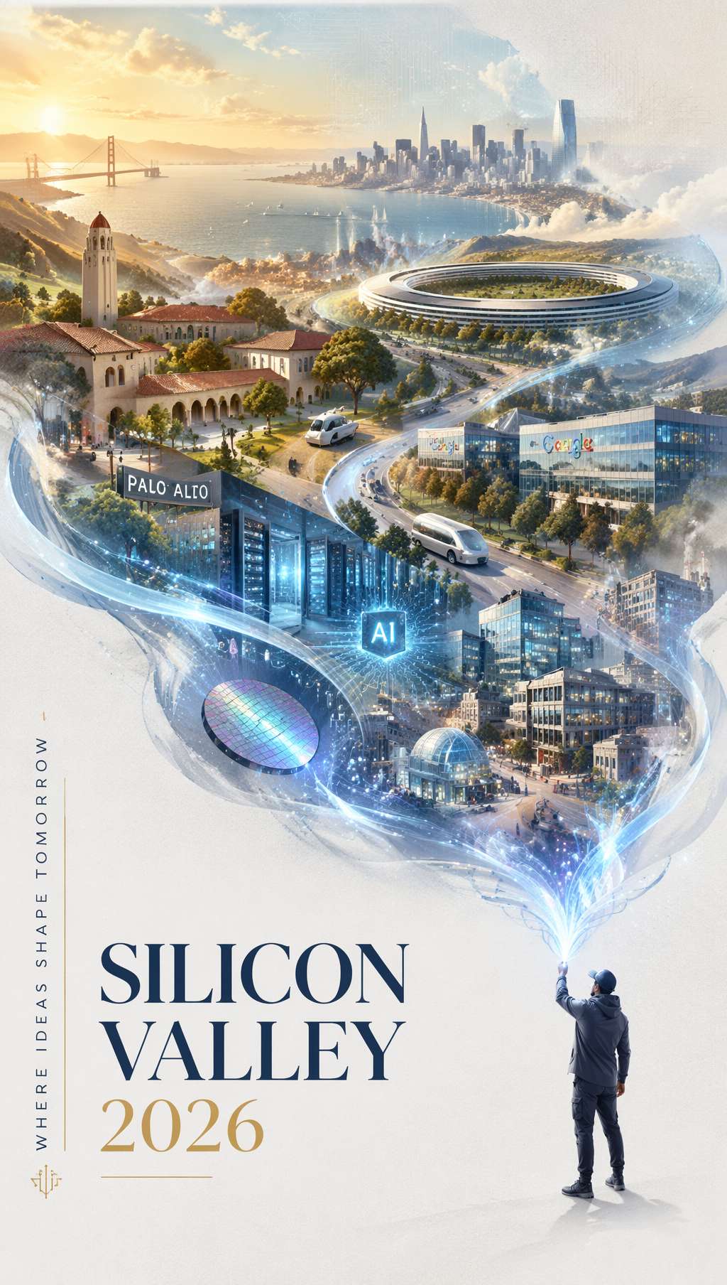 銀藍色光帶流過畫面,化作矽谷地圖與建築——「SILICON VALLEY 2026」優雅排版收尾。提示詞來自 @carsonyungos
社群提示詞(@carsonyungos,節錄):
A refined city promotional poster with a futuristic yet elegant atmosphere. Double exposure composition, preserving an S-shaped sense of flowing movement. On a pure white textured background, a miniature figure releases a long ribbon of luminous silver-blue light. The ribbon flows gracefully through the air, and as it drifts, it magically transforms into a grand landscape blending [city elements]. In the lower-left corner, elegant typography reads "[CITY NAME 2026]" with a vertical promotional slogan: "[your slogan]". Beautiful editorial layout, graceful spacing, clear and complete lettering, premium city branding poster, cinematic lighting.
關鍵技巧:
Double exposure composition—— 雙重曝光(光帶 + 風景疊加)S-shaped sense of flowing movement—— S 型流動構圖(畫面氣韻)elegant typography in the lower-left corner—— 字體退到角落,優雅而不搶戲clear and complete lettering—— 字體清晰完整(避免 AI 渲染缺字)
通用替換變數:
- 城市:
Silicon Valley→Tokyo/Shanghai/New York - 主題:
technology and innovation→art and culture/nature and wellness - 色調:
silver-blue→gold-amber/rose-pink
適用場景:城市旅遊推廣、品牌年報封面、科技公司主視覺、奢侈品牌海報
字體提示詞萬能範本
把上述六種風格抽象出來,得到一個通用範本:
[風格定位] poster with [整體氛圍].
[構圖方式] composition with [關鍵視覺機制].
[Background description].
TYPOGRAPHY: [字體類型] reading "[exact text]",
positioned [位置描述], with [字體處理方式like distortion/material/color].
SUBJECT: [次要主體描述].
COLORS: [主色] + [輔色], [整體色調風格].
STYLE: [風格關鍵詞], [質感關鍵詞], [完成度關鍵詞].
字體處理關鍵詞速查:
| 你想要的效果 | 提示詞關鍵詞 |
|---|---|
| 字體跟隨表面變形 | letterforms conforming to surface curvature |
| 字體物理融入場景 | surface-integrated not floating |
| 字體作為背景主導 | dominated by oversized typography in the background |
| 字體材質化 | letters constructed from [material] texture |
| 字體被遮擋的層次感 | partially occluded by foreground elements |
| 極端透視收縮 | extreme perspective distortion aligned to vanishing point |
| 字體與圖像融合 | double exposure composition |
| 字體作為核心主體 | typography as the hero element of the composition |
結語
什麼時候用 AI 生成字體海報最划算?
- 概念探索階段:3 分鐘測 5 種風格,找到品牌方向
- 預算敏感的新創品牌:沒錢請設計師做主視覺,先用 AI 出第一版
- 社群媒體日更:每天一張主題海報,AI 比手工排版快 10 倍
- 設計師輔助:先用 AI 生成排版靈感,再回 Figma / Photoshop 精修
什麼時候不要用 AI:
- 大型品牌核心 VI(依然需要專業字體設計師)
- 涉及複雜正版字體授權的商用專案
- 印刷尺寸超過 A2 的實體物料(AI 輸出解析度有限)
但對於內容創作者、獨立設計師、新創團隊來說,AI 字體海報已經是當下最快的「從概念到成品」的路徑。把這 6 個提示詞收藏好,想做海報時直接套用——剩下的,交給 GPT Image 2。
提示詞來源
- EvoLinkAI Prompt Library — 海報案例每日更新
- awesome-gpt-image — X 平台熱門字體設計提示詞
Written with pixocto · Images generated by GPT Image 2