AI 포스터 타이포그래피 가이드: 글자를 비주얼 주인공으로 만드는 6가지 스타일
같은 단어, 다른 폰트의 해석 — 타이포그래피 자체가 하나의 시각 언어다
AI 포스터 타이포그래피 가이드: 글자를 비주얼 주인공으로 만드는 6가지 스타일
 같은 단어, 다른 폰트의 해석 — 타이포그래피 자체가 하나의 시각 언어다
피드 속에서 타이포그래피는 곧 주목도다.
손가락을 멈추게 만드는 포스터들을 떠올려 보자. 화면을 뚫을 듯한 거대한 글자가 있거나, 장면과 완전히 하나로 녹아든 슬로건이 있다. 좋은 폰트가 없으면 좋은 포스터도 없다 — 이는 브랜드 디자이너들의 공통된 인식이자, AI 포스터 생성에서 가장 자주 무너지는 지점이기도 하다.
GPT Image 2의 텍스트 렌더링 능력이 한 단계 도약하면서, AI가 처음으로 "디자인 시안 그대로" 복잡한 타이포그래피를 정확히 출력할 수 있게 되었다. 이 글에서는 GitHub 커뮤니티에서 엄선한 타이포그래피 중심의 프롬프트 6개(awesome-gpt-image-2, awesome-gpt-image)를 소개한다. 초현실, 고전, 정보 밀집형, 레트로, 패션, 미래지향까지 6가지 톤을 아우르며, 각각 즉시 활용 가능한 명확한 테크닉을 담고 있다.
스타일 1: 초대형 원근 타이포그래피 — 글자를 장면에 "스며들게" 하기
글자가 더 이상 화면 위에 "떠 있지" 않고, 장면과 물리적으로 융합되도록 만든다.
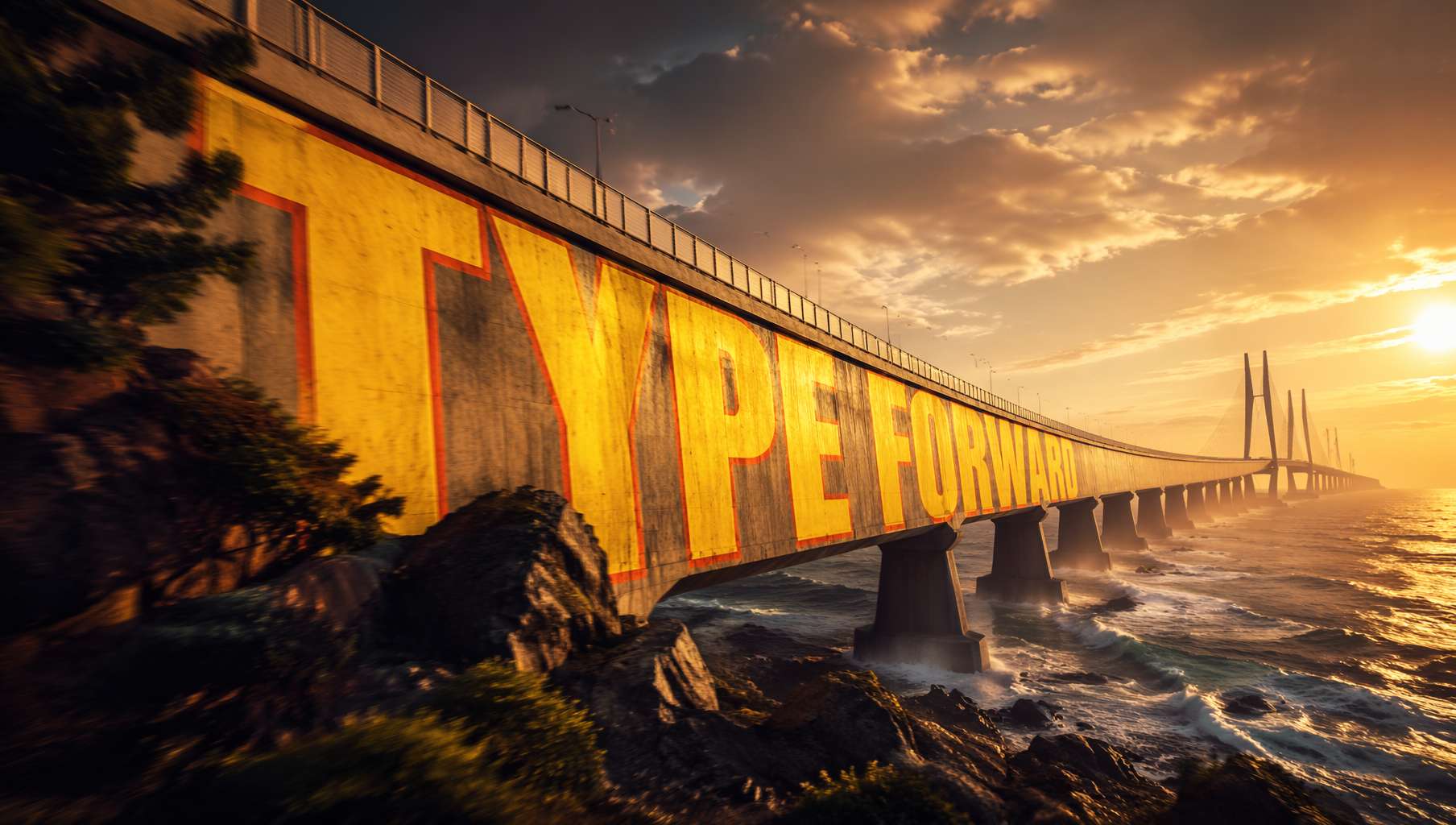 해상교 위에 페인트칠된 거대한 글자가 다리의 곡률을 따라 자연스럽게 변형된다 — 영화 포스터급 비주얼 임팩트. 프롬프트 출처 @xpg0970
커뮤니티 프롬프트 (@xpg0970):
Scene: Side view of a cross-sea bridge, dramatic cinematic angle. Giant bold sans-serif text "[text]" painted onto the surface of the bridge, progressively foreshortened from near to far end, letterforms conforming to surface curvature, surface-integrated not floating. Text partially occluded by foreground elements, creating depth-layering effect. Oversized bright yellow + sharp orange outline, extreme perspective distortion aligned to vanishing point. Cinematic lighting, motion blur, poster-grade dynamic integrated typography, modern advertising aesthetics.
핵심 테크닉:
letterforms conforming to surface curvature— 글자가 표면 곡률을 따라 변형되며, 단순히 평면에 붙은 게 아님surface-integrated not floating— 표면과 일체화, 떠 있지 않음extreme perspective distortion aligned to vanishing point— 극단적 원근감, 소실점을 향한 수렴partially occluded by foreground elements— 전경 요소에 일부 가려져 공간감 형성
활용 분야: 영화 포스터, 스포츠 브랜드 광고, 도시 홍보 영상 비주얼
스타일 2: 한자 서예 필사본 — AI가 천 년의 필치를 재현하다
GPT Image 2의 한자 서예 이해력이 비약적으로 발전하면서, "고전 필사본 재현"이 가능해졌다.
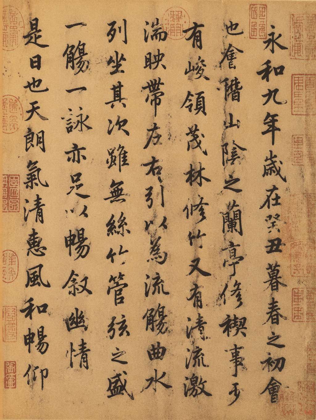 《난정집서》 스타일 필사본, 왕희지 행서의 필치, 황갈색 선지 + 주홍색 인장. 프롬프트 출처 @MrLarus
커뮤니티 프롬프트 (@MrLarus):
Generate an image of the authentic manuscript of [classic text title], and incorporate the emotional core of the work into the calligraphy.
심화 활용 — 추가 스타일 가이드:
in Wang Xizhi style— 왕희지 풍 (행서의 유려함)in Yan Zhenqing style— 안진경 풍 (해서의 웅혼함)with stronger emotional expression— 감정 표현 강화on aged xuan rice paper with red seal stamps— 황갈색 선지 + 주홍색 인장
핵심 테크닉:
- 작품명 자체를 "스타일과 정서"의 단서로 활용 — AI가 작품의 감정을 글씨에 녹여낸다
- 매체(선지/견본/죽간)를 명시하면 사실감이 크게 향상된다
- "인장/제발/먹 번짐" 디테일을 추가하면 골동품 같은 분위기가 살아난다
활용 분야: 문화 브랜드, 문화상품, 박물관 포스터, 동양풍 게임 일러스트
스타일 3: 정보 밀집형 포스터 — 서예 + 도표 + 기호의 결합
타이포그래피 활용 중 가장 까다로운 영역 — 수많은 작은 글자, 대칭 레이아웃, 기호 언어가 모두 동원된다.
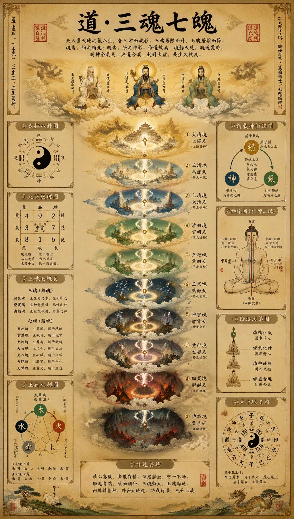 도교 필사본 스타일의 인포그래픽 포스터: 서예 타이틀 + 다층 도표 + 고문자 주석 + 주홍 인장. 프롬프트 출처 @leyu37829
커뮤니티 프롬프트 (@leyu37829, 발췌):
A highly detailed vertical Taoist esoteric infographic poster in the style of an ancient Chinese religious scroll, printed on aged beige rice paper. At the top center, large black brush-calligraphy title text reads "道·三魂七魄". The composition is perfectly symmetrical and centered on a glowing vertical spiritual axis. Around the central column, include 9 labeled side panels and diagrams in traditional Chinese layout: bagua, yin-yang, soul lists, five-elements diagram, essence-qi-spirit cycle, meridian body diagram. Use many small Chinese labels throughout, with classical seal stamps in red. Museum-quality Daoist metaphysical chart, ultra intricate, hand-painted gongbi plus ink wash illustration.
핵심 테크닉:
perfectly symmetrical, centered on a vertical axis— 중심축 대칭, 종교 의례적 무게감9 labeled side panels and diagrams— 구체적인 수량 지정, AI가 그 수에 맞춰 레이아웃을 짠다Use many small Chinese labels throughout— 작은 글자 주석을 다량 강제classical seal stamps in red— 붉은 인장이 시각적 앵커 역할
활용 분야: 지식 콘텐츠 크리에이터의 정보 카드, 문화 교양 포스터, Pinterest용 롱 이미지, 박물관 전시물
스타일 4: 레트로 선전 포스터 폰트 — 빨강과 금색이 만드는 강렬함
1980년대 레트로 폰트의 귀환 — 거칠고, 뜨겁고, 강한 이데올로기적 시각 기억을 품은 스타일.
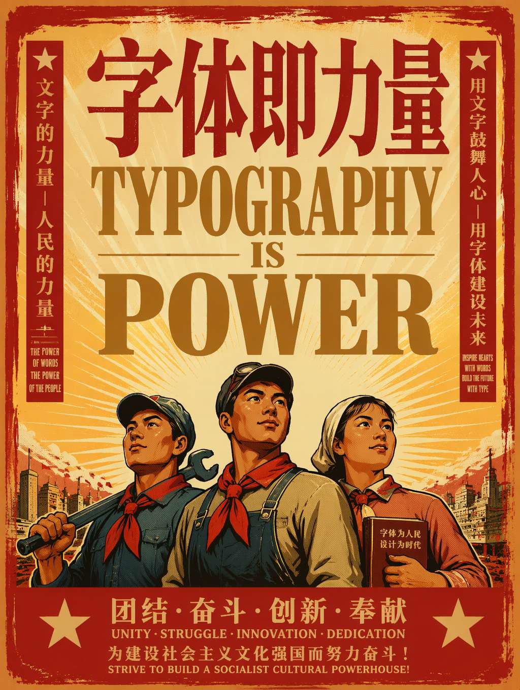 "폰트가 곧 힘이다" — 거친 빨강·금색 세리프 대문자 + 노동영웅 인물 + 태양 광선. 레트로 선전 포스터의 정석 공식. 프롬프트 @akokoi1 각색
커뮤니티 프롬프트 템플릿 (@akokoi1):
Generate a 1980s propaganda poster. Use the exact slogan "[your slogan here]". Include [characters], and give [character] a [accessory].
핵심 테크닉:
1980s propaganda poster— 단어 하나로 전체 비주얼 시스템을 고정Use the exact slogan— 폰트에 들어갈 텍스트를 정확히 지정 (GPT Image 2의 텍스트 렌더링 강점)- 구체적인 인물 + 소품을 더해 서사성을 강화
- 컬러: 빨강 메인, 금색 보조, 크림 베이지 배경 (빨강·노랑·검정 조합이 1980s 포스터의 시그니처)
변형 방향:
- 소비에트 구성주의 스타일:
Soviet constructivist poster로 변경 - 중국 혁명 포스터 스타일:
Chinese revolutionary poster aesthetic추가 - 바우하우스 폰트 스타일:
1920s Bauhaus poster, geometric sans-serif로 변경
활용 분야: 노스탤지어 마케팅, 레트로 트렌드 브랜드, 팝아트 굿즈, Z세대 레트로 콘텐츠
스타일 5: 매거진 에디토리얼 대형 폰트 — 패션 광고의 타이포그래피 주도 미학
패션과 스트리트 브랜드 광고의 최신 트렌드: 모델과 제품을 압도하며 폰트를 주인공으로 세운다.
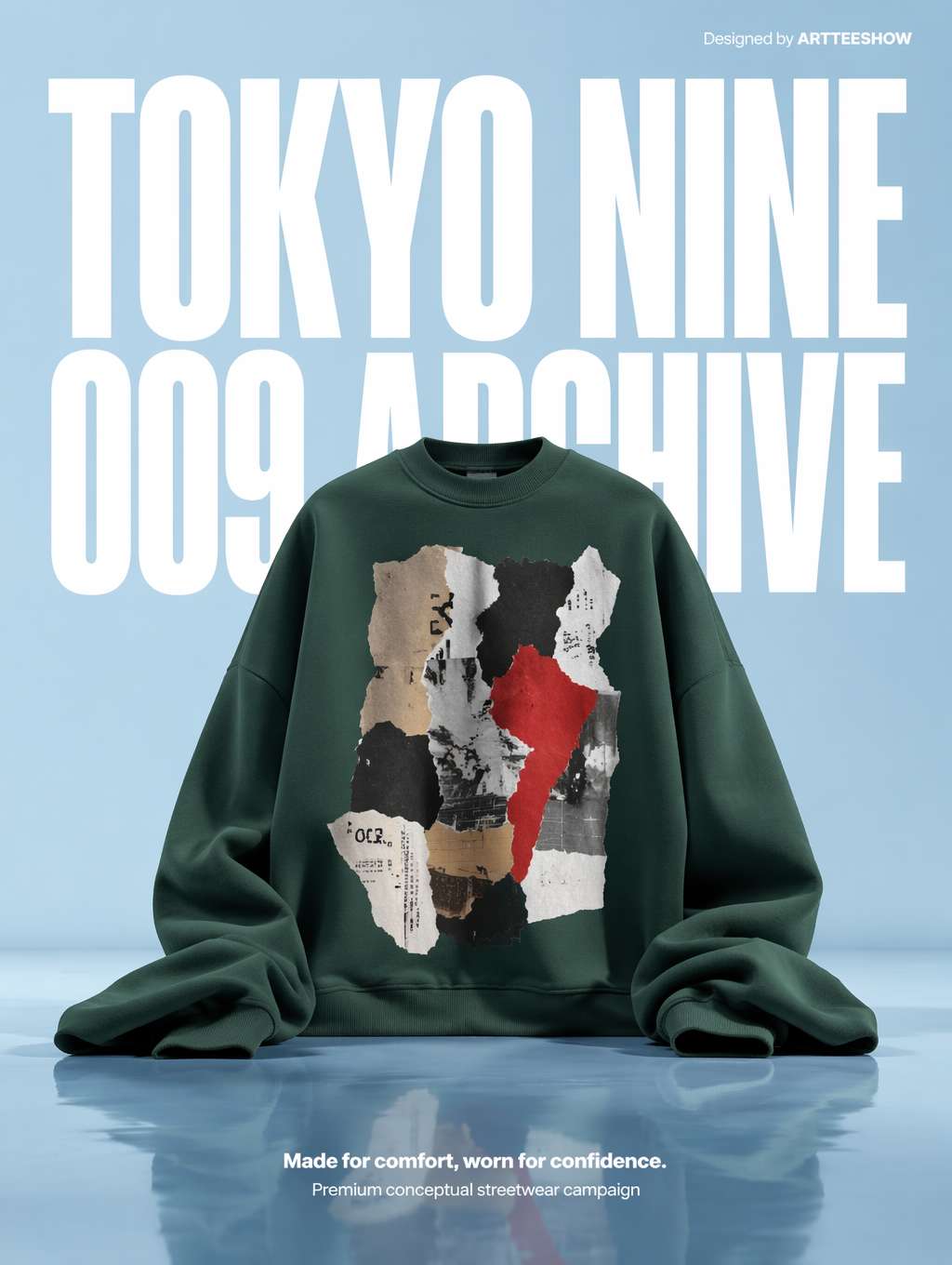 초대형 흰색 콘덴스드 산세리프가 배경을 지배하고, 그린 후디가 조각상 같은 주체로 자리한다 — 매거진풍 스트리트 브랜드 광고의 정석. 프롬프트 출처 @_LaurentB
커뮤니티 프롬프트 (@_LaurentB, 발췌):
A clean editorial fashion advertisement poster on a pale powder-blue studio background with a glossy reflective floor. The composition is vertical and minimal, dominated by oversized bold white condensed sans-serif typography in the background reading "TOKYO NINE" on the top line and "009 ARCHIVE" below, filling most of the upper half behind the subject. Centered in the lower middle is an oversized [product]. Premium conceptual streetwear campaign aesthetic, crisp studio lighting, surreal scale contrast.
핵심 테크닉:
dominated by oversized bold condensed sans-serif typography— 폰트가 다른 모든 요소를 압도condensed sans-serif— 콘덴스드 산세리프 (에디토리얼 폰트의 핵심)filling most of the upper half behind the subject— 폰트가 배경에 있으면서도 화면을 지배surreal scale contrast— 폰트와 제품 간의 초현실적 스케일 대비
폰트 용어 빠른 정리:
condensed sans-serif= 콘덴스드 산세리프 (좁고 높은 형태)expanded sans-serif= 익스팬디드 산세리프 (낮고 넓은 형태)display serif= 디스플레이 세리프 (대형 타이틀용)slab serif= 슬래브 세리프 (두껍고 묵직)geometric sans= 지오메트릭 산세리프 (미니멀하고 이성적)
활용 분야: 스트리트 브랜드 메인 비주얼, 패션 이커머스, 스포츠 브랜드, 룩북, 스트리트 매거진
스타일 6: 모던 더블 익스포저 포스터 — 도시·브랜드의 고급스러운 표현
타이포그래피와 그래픽을 "광선/이중 노출"로 융합하는 방식은 현재 가장 인기 있는 하이엔드 브랜드 포스터 형식이다.
 은청색 광선이 화면을 흐르며 실리콘밸리의 지도와 건축물로 변모하고, "SILICON VALLEY 2026"이 우아한 타이포그래피로 마무리된다. 프롬프트 출처 @carsonyungos
커뮤니티 프롬프트 (@carsonyungos, 발췌):
A refined city promotional poster with a futuristic yet elegant atmosphere. Double exposure composition, preserving an S-shaped sense of flowing movement. On a pure white textured background, a miniature figure releases a long ribbon of luminous silver-blue light. The ribbon flows gracefully through the air, and as it drifts, it magically transforms into a grand landscape blending [city elements]. In the lower-left corner, elegant typography reads "[CITY NAME 2026]" with a vertical promotional slogan: "[your slogan]". Beautiful editorial layout, graceful spacing, clear and complete lettering, premium city branding poster, cinematic lighting.
핵심 테크닉:
Double exposure composition— 더블 익스포저 (광선 + 풍경의 중첩)S-shaped sense of flowing movement— S자 흐름 구도 (화면의 기운생동)elegant typography in the lower-left corner— 폰트는 모서리로 물러나 우아하게, 주연을 빼앗지 않음clear and complete lettering— 글자가 선명하고 온전 (AI 렌더링 시 글자 누락 방지)
범용 치환 변수:
- 도시:
Silicon Valley→Tokyo/Shanghai/New York - 테마:
technology and innovation→art and culture/nature and wellness - 톤:
silver-blue→gold-amber/rose-pink
활용 분야: 도시 관광 홍보, 브랜드 연차보고서 표지, 테크 기업 메인 비주얼, 럭셔리 브랜드 포스터
타이포그래피 프롬프트 만능 템플릿
위의 6가지 스타일에서 공통점을 추출하면 다음과 같은 범용 템플릿이 나온다:
[풍격 정의] poster with [전체 분위기].
[구도 방식] composition with [핵심 시각 메커니즘].
[Background description].
TYPOGRAPHY: [폰트 종류] reading "[exact text]",
positioned [위치 묘사], with [폰트 처리 방식 like distortion/material/color].
SUBJECT: [부차적 주체 묘사].
COLORS: [메인 컬러] + [서브 컬러], [전체 색조 스타일].
STYLE: [스타일 키워드], [질감 키워드], [완성도 키워드].
폰트 처리 키워드 빠른 정리:
| 원하는 효과 | 프롬프트 키워드 |
|---|---|
| 폰트가 표면을 따라 변형 | letterforms conforming to surface curvature |
| 폰트가 장면에 물리적으로 융합 | surface-integrated not floating |
| 폰트가 배경으로서 화면 지배 | dominated by oversized typography in the background |
| 폰트의 재질화 | letters constructed from [material] texture |
| 폰트의 가려짐으로 인한 레이어감 | partially occluded by foreground elements |
| 극단적 원근 수렴 | extreme perspective distortion aligned to vanishing point |
| 폰트와 이미지의 융합 | double exposure composition |
| 폰트가 핵심 주체 | typography as the hero element of the composition |
마치며
언제 AI로 타이포그래피 포스터를 만드는 것이 가장 효율적일까?
- 컨셉 탐색 단계: 3분 안에 5가지 스타일을 테스트하고 브랜드 방향을 잡을 수 있음
- 예산이 빠듯한 스타트업 브랜드: 메인 비주얼을 맡길 디자이너가 없을 때, 일단 AI로 첫 버전부터
- 소셜미디어 일일 콘텐츠: 매일 한 장의 테마 포스터, 수작업 레이아웃보다 10배 빠름
- 디자이너 보조 도구: AI로 레이아웃 영감을 먼저 뽑고, Figma/Photoshop으로 정교화
AI를 쓰지 말아야 할 때:
- 대형 브랜드의 핵심 VI (여전히 전문 타입 디자이너가 필요)
- 정식 서체 라이선스가 얽힌 복잡한 상업 프로젝트
- A2 이상의 인쇄물 (AI 출력 해상도의 한계)
하지만 콘텐츠 크리에이터, 인디 디자이너, 초기 스타트업 팀에게 AI 타이포그래피 포스터는 현재 "컨셉에서 결과물까지" 가장 빠른 경로다. 이 6개 프롬프트를 잘 저장해 두었다가 포스터가 필요할 때 그대로 적용해 보자 — 나머지는 GPT Image 2가 알아서 해 준다.
프롬프트 출처
- EvoLinkAI Prompt Library — 포스터 사례 매일 업데이트
- awesome-gpt-image — X 플랫폼에서 화제가 된 타이포그래피 프롬프트 모음
Written with pixocto · Images generated by GPT Image 2