19개 광고 크리에이티브 프롬프트 엄선: GPT Image 2로 브랜드 시각 한 번에 생성
브랜드 VI부터 럭셔리 화보까지, 외식 전단부터 기술 포스터까지——한 문장 프롬프트가 바로 광고팀 전체입니다.
19개 광고 크리에이티브 프롬프트 엄선: GPT Image 2로 브랜드 시각 한 번에 생성
브랜드 VI부터 럭셔리 화보까지, 외식 전단부터 기술 포스터까지——한 문장 프롬프트가 바로 광고팀 전체입니다.
광고 시각으로 고민하고 계신가요? 사진작가, 보정사, 레이아웃 디자이너를 일일이 찾다 보니 시간과 예산이 아깝기만 합니다. GPT Image 2는 이 모든 것을 바꾸고 있습니다. 텍스트 레이아웃의 정확한 제어, 복잡한 구도의 이해 능력, 상업 사진 수준의 화면 질감까지 갖춘 이 도구 덕분에 광고 크리에이티브가 "떠올림"에서 "확인"까지의 거리가 하나의 프롬프트로 단축되었습니다. 오픈소스 프로젝트 awesome-gpt-image-2-prompts에서 엄선한 19개 광고 크리에이티브 사례를 소개합니다. 브랜드 디자인, 패션 화보, 식품 패키징, 기술 제품 등 다양한 장면을 포함하고 있으니, AI 광고의 실제 수준이 어디까지 갈 수 있는지 함께 살펴보겠습니다.
읽기 팁: 각 사례의 프롬프트는 원문(영어/일본어)을 그대로 보존합니다. 번역하지 않으니 직접 복사해서 사용하세요. 한국어 「분석」 섹션에서는 핵심 기법을 설명하고, 「활용」 섹션에서는 어떤 장면에 적용할 수 있는지 알려드립니다.
장면 1: 브랜드 시각과 IP 디자인
브랜드 시각은 광고의 기초입니다. 전통적으로 완전한 브랜드 VI 시스템을 만들려면 디자이너가 몇 주를 투자해야 합니다. 로고 디자인부터 주변 상품, 색상 시스템부터 소셜 미디어 템플릿까지 매우 방대합니다. 아래 세 개의 프롬프트는 구조화된 JSON으로 캐릭터 설정부터 파생 상품까지 완전한 브랜드 시스템을 한 번에 생성하는 방법을 보여줍니다.
1.1 — 애니메이션 캐릭터 브랜드 전체 물료
저자: @chi_vc_ | 출처: ad-creative.md Case 112
{
  "type": "brand identity and merchandise design board",
  "theme": {
    "color_palette": "{argument name=\"theme color\" default=\"pastel pink\"} and white",
    "motif": "{argument name=\"motif\" default=\"cherry blossoms\"} and pink hearts"
  },
  "character": {
    "description": "anime girl with short brown bob hair, pink eyes, wearing a white hoodie, gentle smile"
  },
  "branding": {
    "main_logo": "{argument name=\"character name\" default=\"癒音ちー\"}",
    "sub_logo": "{argument name=\"character subtext\" default=\"ゆおんちー\"}"
  },
  "layout": {
    "sections": [
      {
        "type": "header banner",
        "position": "top",
        "elements": ["large main logo", "sub logo", "cherry blossom graphics", "character portrait on the right"]
      },
      {
        "type": "product packaging",
        "position": "middle left",
        "elements": ["1 square box with heart-shaped transparent window showing pink heart candies", "character illustration on box", "2 individual candy wrappers", "5 scattered heart candies"]
      },
      {
        "type": "promotional poster",
        "position": "middle right",
        "elements": ["character portrait", "heart-shaped candy bowl", "main logo", "text '4.26 NEW OPEN'", "text '{argument name=\"social handle\" default=\"@yuonchii\"}'"]
      },
      {
        "type": "horizontal web banner",
        "position": "lower middle",
        "elements": ["main logo", "cherry blossoms", "character portrait on the right"]
      },
      {
        "type": "social media profile mockup",
        "position": "bottom left",
        "elements": ["header image with logo", "1 circular profile picture", "handle '{argument name=\"social handle\" default=\"@yuonchii\"}'", "1 follow button", "mock bio text"]
      },
      {
        "type": "merchandise collection",
        "position": "bottom right",
        "count": 9,
        "items": ["1 white t-shirt with logo", "1 white mug with character", "4 round pin badges", "1 acrylic keychain", "2 candy packets"]
      }
    ]
  }
}
분석:
sections배열로 전체 레이아웃을 6개 영역으로 나누어 배너부터 주변 상품까지 한 번에 생성합니다. 완전한 브랜드 제안과 같은 수준입니다.character필드가 캐릭터 설명을 통합하므로, 모든 물료에서 캐릭터 이미지가 일관됩니다.- 각 영역을 정확한 개수까지 명시합니다("4 round pin badges", "2 candy wrappers"). AI의 자유로운 해석을 방지합니다.
활용: VTuber 데뷔 물료, 가상 아이돌 브랜드 패키지, IP 콜라보 상품 기획
1.2 — 18 패널 마스코트 브랜드 디자인 매뉴얼
저자: @Colin_Leeee | 출처: ad-creative.md Case 107
{
  "type": "18-panel brand identity and character design document",
  "brand": {
    "name": "{argument name=\"brand name\" default=\"沐阳 MUYANG TEA\"}",
    "industry": "{argument name=\"industry\" default=\"tea shop\"}",
    "colors": ["{argument name=\"primary color\" default=\"yellow\"}", "{argument name=\"secondary color\" default=\"green\"}", "white", "brown", "dark green"]
  },
  "subject": "{argument name=\"character description\" default=\"3D rendered cute Shiba Inu mascot wearing a green apron\"}",
  "layout": {
    "grid": "3 columns by 6 rows",
    "sections": [
      {
        "title": "01 품牌DNA分析 / BRAND DNA ANALYSIS",
        "elements": ["logo", "5 color swatches", "6 icons", "target audience charts"]
      },
      {
        "title": "02 개념 무드보드 / CONCEPT MOODBOARD",
        "elements": ["5 photo references", "4 mood icons", "design equation"]
      },
      {
        "title": "03 형태 연구 / FORM STUDY",
        "elements": ["4 logo anatomy icons", "4 evolution steps", "4 silhouettes"]
      },
      {
        "title": "04 개념 탐색 / CONCEPT EXPLORATION",
        "elements": ["12 line-art character sketches"]
      },
      {
        "title": "05 정제 선화 / REFINED LINE ART",
        "elements": ["3 rows of front and side line art with proportion guides"]
      },
      {
        "title": "06 세부 정밀화 / DETAIL REFINEMENT",
        "elements": ["2 full-body renders with labels", "4 circular close-ups"]
      },
      {
        "title": "07 표정 시트 / EXPRESSION SHEET",
        "elements": ["11 3D rendered head expressions"]
      },
      {
        "title": "08 포즈 라이브러리 / POSE LIBRARY",
        "elements": ["9 full-body 3D rendered poses"]
      },
      {
        "title": "09 회전 뷰 / TURNAROUND VIEW",
        "elements": ["5 full-body 3D renders", "5 matching line-art views"]
      },
      {
        "title": "10 색상 개발 / COLOR DEVELOPMENT",
        "elements": ["5 rows of 5-color palettes", "color psychology text"]
      },
      {
        "title": "11 재질 사양 / MATERIAL SPECIFICATION",
        "elements": ["5 texture swatches", "property sliders", "4 manufacturing icons"]
      },
      {
        "title": "12 색상 적용 / COLOR APPLICATION",
        "elements": ["4 color variant renders", "2 light/dark renders", "4 contrast rating circles"]
      },
      {
        "title": "13 구성 가이드 / CONSTRUCTION GUIDE",
        "elements": ["2 line-art diagrams for geometry and grid"]
      },
      {
        "title": "14 디자인 시스템 규칙 / DESIGN SYSTEM RULES",
        "elements": ["minimum size icons", "clear space diagram", "4 usage examples"]
      },
      {
        "title": "15 자산 변형 / ASSET VARIANTS",
        "elements": ["3 size variants", "3 line-art variants", "3 simplified flat heads"]
      },
      {
        "title": "16 디지털 적용 / DIGITAL APPLICATIONS",
        "elements": ["1 app icon", "2 social avatars", "UI elements", "3-step animation cycle"]
      },
      {
        "title": "17 실물 적용 / PHYSICAL APPLICATIONS",
        "elements": ["plush toy mockup", "packaging mockup", "merchandise mockup", "storefront mockup"]
      },
      {
        "title": "18 최종 메인 시각 / FINAL RENDERING",
        "elements": ["large high-res 3D render of mascot holding tea", "logo", "file format list"]
      }
    ]
  }
}
분석:
- 18개 패널이 전문 브랜드 디자인의 완전한 프로세스를 커버합니다. DNA 분석부터 최종 렌더링까지 디자인 회사에서 전달하는 브랜드 매뉴얼과 같은 수준입니다.
grid: "3 columns by 6 rows"로 네트워크 레이아웃을 명확히 지정하면, AI가 전문 디자인 문서 형식의 배치를 따릅니다.- 각 패널마다 중영 이중 제목이 있어서 국제 브랜드 요구를 모두 만족합니다.
활용: 브랜드 제안 프레젠테이션, 마스코트 디자인 전체 프로젝트, 스타트업 브랜드 매뉴얼
1.3 — 몽환적 해파리 시리즈 홈 포스터
저자: @Ayu_AI_0912 | 출처: ad-creative.md Case 167
{"type":"pastel lifestyle poster / character room-goods feature sheet","theme":"soft dreamy lavender jellyfish aesthetic","style":"Japanese cute editorial graphic, airy white background, pastel lilac palette, delicate handwritten notes, sparkles and tiny doodles, soft product photography mixed with magazine layout","subject":{"character":{"name":"{argument name=\"character name\" default=\"くらげちゃん\"}","appearance":"young woman with a short platinum-blonde bob haircut, wearing a fluffy pale-lavender zip hoodie over a white inner top, shown from chest up on the lower right, face intentionally obscured with a plain beige rectangle"}},"layout":{"orientation":"vertical poster","background":"clean white with faint pastel doodles of stars, bubbles, tiny jellyfish, and musical notes","sections":[{"title":"header","position":"top","count":5,"labels":["speech bubble intro","main title","small subtitle GOODS","horizontal lavender ribbon tagline","round badge on the top right"]},{"title":"featured goods grid","position":"upper and middle left","count":6,"labels":["ゆらゆらくらげランプ","くらげと夢見るベッドリネン","くらげシェルミラー","くらげグラデマグ","くらげのときめき収納ボックス","くらげふわもこマット"]},{"title":"side handwritten note","position":"upper right","count":1,"labels":["みんなも くらげちゃんRoomで いっしょに まったりしよー♡♡"]},{"title":"room concept box","position":"lower left","count":1,"labels":["くらげちゃんの お部屋作りのこだわり"]},{"title":"pick up circle","position":"lower center-left","count":1,"labels":["Pick up!"]}],"product_images":{"count":6,"items":[{"name":"ゆらゆらくらげランプ","description":"small translucent jellyfish-shaped lamp on a white base, glowing softly in pale blue-lavender"},{"name":"くらげと夢見るベッドリネン","description":"plush pastel-lavender bed with fluffy comforter and pillows, dreamy cozy bedroom styling"},{"name":"くらげシェルミラー","description":"small tabletop mirror with a puffy shell-like pastel-lilac frame and rounded base"},{"name":"くらげグラデマグ","description":"ceramic mug with lavender-to-pink gradient and a simple jellyfish illustration"},{"name":"くらげのときめき収納ボックス","description":"pastel storage box holding cosmetics and small bottles, decorated with a jellyfish emblem"},{"name":"くらげふわもこマット","description":"small fluffy cloud-like or jellyfish-like mat in pale lavender and white"}]},"text_elements":{"main_title":"{argument name=\"headline text\" default=\"くらげちゃんの お部屋アイテム\"}","badge_text":"くらげちゃんの Room お部屋作りの こだわりポイントも 教えちゃうよ。","tagline":"ふわふわで甘くて、ちょっぴり夢みたいな私のお部屋へようこそ♡","speech_bubble":"くらげちゃんの お気に入りだけ集めた お部屋アイテムを紹介するよ♪","concept_points":{"count":3,"items":["색은 흰색과 라벤더로 통일!","빛이 모이는 부드러운 공간에","친구 들어있는 아이템에 둘러싸여 자기다워야 하는 공간을 소중히 여기고 있어요♪"]},"product_blurbs":"each product has a short handwritten Japanese description in a cute casual font beside or below the image"},"composition":"the poster is left-heavy with product cards and text, while the character portrait occupies the lower right third, slightly overlapping the layout","color_palette":{"count":5,"colors":["white","pastel lavender","soft lilac","pale gray-violet","touches of pastel blue-pink gradient"]},"rendering_notes":"keep everything very soft, feminine, and cozy; rounded corners on all product photos; mix of bold Japanese headline typography and light handwritten annotations; subtle shadows; clean high-key lighting; social-media-ready editorial collage aesthetic"}
분석:
- 한 개의 JSON에서 캐릭터 이미지, 6개 제품의 시각 설명, 카피 텍스트와 배치 위치를 동시에 정의합니다. 정보 밀도가 매우 높습니다.
rendering_notes필드가 전역 스타일 지침으로 작용합니다. 둥근 모서리 사진, 손글씨 주석, 하이 키 조명 같은 요소로 전체 시각을 통일합니다.composition필드에서 AI에게 명확히 지시합니다. 레이아웃 중심이 왼쪽으로 기울어지고, 캐릭터가 오른쪽 아래 3분의 1 지점에 있다고 알려줍니다. 시각적 흐름을 완벽히 제어합니다.
활용: 캐릭터 주변 상품 포스터, 라이프스타일 브랜드 카탈로그, 소셜 커머스 제품 페이지
장면 2: 패션과 럭셔리 광고
패션 광고는 질감, 분위기, 브랜드 톤을 추구합니다. 이것은 정확히 GPT Image 2의 강점입니다. 레이싱 스타일의 시계부터 네온사인 아래 운동화까지, 에디토리얼 수준의 향수 클로즈업부터 거리 패션 포스터까지, 이 프롬프트 모음은 텍스트로 상업 촬영 수준의 빛, 물질감, 구도를 정확히 제어하는 방법을 보여줍니다.
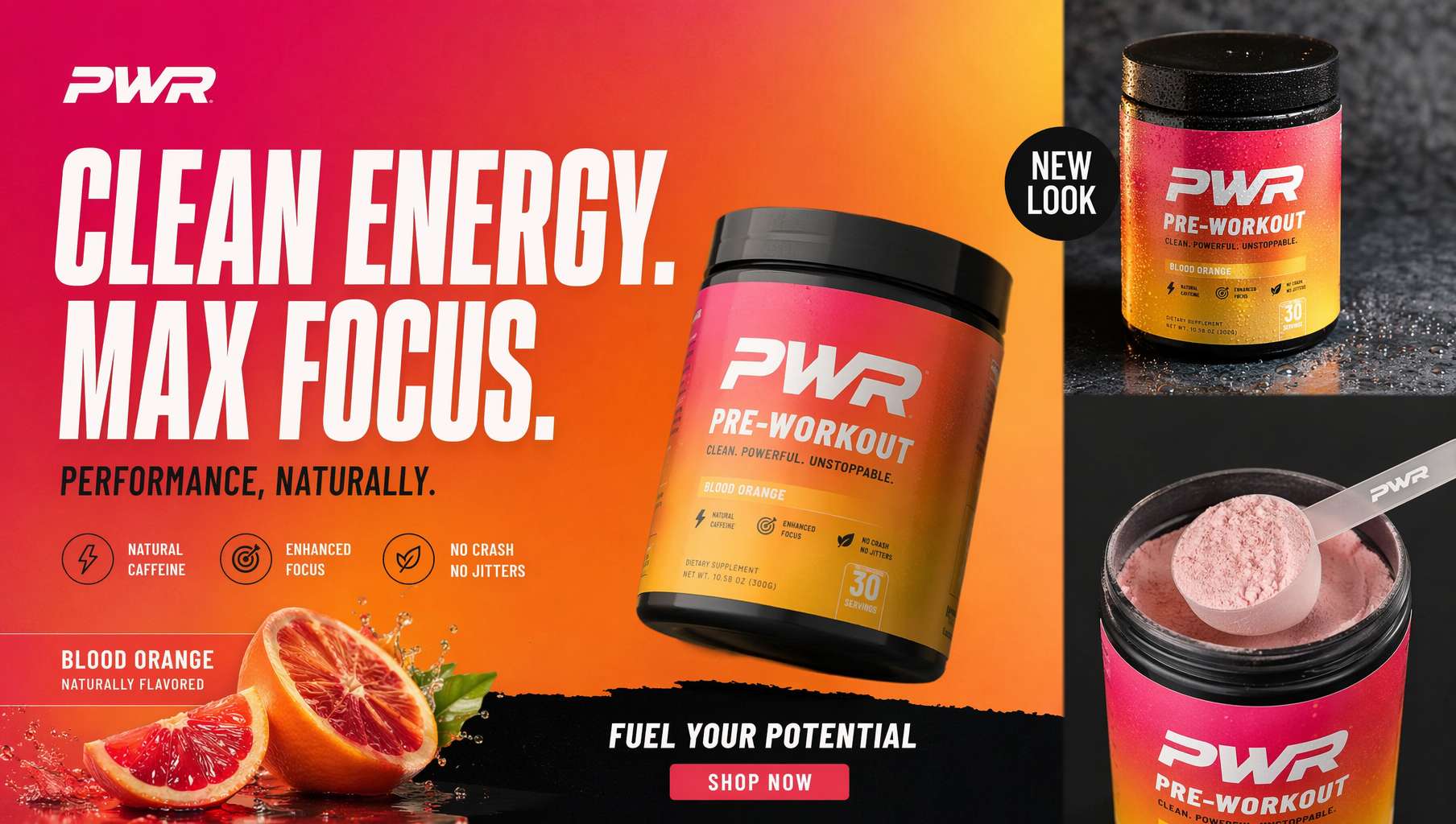
2.1 — 레이싱 스타일 럭셔리 시계 광고
저자: @AlwaveNazca | 출처: ad-creative.md Case 144
A dramatic luxury product advertising image for a motorsport-inspired chronograph wristwatch in a dark studio. Center-left foreground, show a single stainless steel chronograph watch standing upright at a slight three-quarter angle, with a black dial, two red-accent subdials, slim silver hour markers, a tachymeter bezel, and visible crown and pushers on the right side. The watch has a black leather strap with bold red stitching along both edges and a sporty premium finish. To the right of the watch, place one black square presentation box slightly behind it, textured like leather, with red stitching around the lid and a silver embossed eye-shaped logo above the text "NESS STUDIO" and smaller red text "TRACK SURFACE." At the top center of the composition, add the same silver eye logo with the words "NESS STUDIO" and smaller "BY NICOLAS." Across the background, place one oversized blurred word, {argument name="headline text" default="PRECISION"}, in large gray capital letters spanning nearly the full width. The scene is set against a deep black background with cinematic red and white horizontal light streaks crossing behind the products from left to right, suggesting speed and racetrack energy. Use a glossy wet ground plane with reflective texture, catching red highlights and mirrorlike reflections beneath the watch and box. At the bottom center, add the text "CHRONOGRAPH SERIES" in clean white spaced capitals with thin red horizontal lines extending on both sides, and below it smaller red capitals reading {argument name="tagline text" default="ALSACE MADE"}. Color palette: black, charcoal gray, silver steel, vivid racing red, and a touch of white. Lighting should be high-contrast and premium, with crisp specular highlights on the metal case, subtle soft fill on the box, and moody shadows. Overall style: ultra-polished commercial product photography, luxury watch campaign, sharp focus on the products, sleek branding, high-end automotive aesthetic.
분석:
- 조명 설명이 매우 전문적입니다. "crisp specular highlights on the metal case", "glossy wet ground plane with reflective texture" 같은 표현은 상업 촬영사의 용어입니다.
- 색상은 검정, 회색, 은색, 빨강 네 가지 톤으로 엄격히 제한됩니다.
Color palette필드에서 명시적으로 선언합니다. - 배경의 "horizontal light streaks"는 스피드감을 암시하며, 레이싱 주제와 호응합니다. 동시에 제품을 주인공으로 밀어내지 않습니다.
활용: 시계 브랜드 광고, 자동차 주변 제품, 고급 남성 액세서리 프로모션
2.2 — 네온 나이키 스포츠 대작
저자: @AlwaveNazca | 출처: ad-creative.md Case 145
A high-energy vertical Nike fashion campaign poster featuring a single athletic young woman mid-jump against a futuristic neon studio background. She is captured in a dynamic airborne pose with one knee bent up, the other leg folded back, one arm extended outward and the other bent near her chest, conveying motion and power. Her face is obscured by a clean rectangular blur block centered over the face. She wears a cropped iridescent white hooded windbreaker with a black zipper and small Nike logo on the chest, holographic metallic lavender-blue leggings with a subtle Nike swoosh on the thigh, a black branded waistband visible above the leggings, and white chunky Nike sneakers. Her brown hair is tied in a high ponytail flying outward with the jump. Behind her, enormous glowing white serif letters spell "NIKE" across the upper half, with a small white Nike swoosh centered above the word. Across the middle background, the phrase "LUMINA" appears once in wide bold glowing letters with a horizontal glitch and scanline distortion effect, partially obscured by the model. The color palette is saturated magenta, violet, cyan, and electric blue with strong bloom, glossy highlights, lens flares, and chromatic aberration. Add sweeping circular light trails wrapping around the model's legs and body, suggesting speed and motion. The overall style is premium sportswear advertising, ultra-polished, cinematic, high contrast, hyperreal retouching, crisp product detail, dramatic rim lighting, and a luminous holographic aesthetic. Place 2 small text lines at the bottom: bottom left reads {argument name="tagline text" default="LIGHT. MOTION. ENERGY."}, bottom right reads {argument name="collection name" default="NIKE LUMINA COLLECTION"} followed by a small Nike swoosh. Include exactly 3 visible Nike swooshes total: 1 above the large NIKE headline, 1 on the jacket chest, and 1 on the leggings.
분석:
- "face is obscured by a clean rectangular blur block"는 영리한 처리 방식입니다. 얼굴 생성 품질 문제를 피하면서도 패션감을 강화합니다.
- 로고 개수를 정확히 제어합니다: "exactly 3 visible Nike swooshes total". 각각의 위치를 지정합니다.
- 후처리 효과 용어가 매우 구체적입니다: bloom, lens flares, chromatic aberration, scanline distortion. 모두 실제 후처리 용어입니다.
활용: 스포츠 브랜드 포스터, 운동화 발매 프로모션, 트렌드 잡지 표지
2.3 — 거리 패션 운동화 포스터
저자: @AlwaveNazca | 출처: ad-creative.md Case 146
Create a bold streetwear poster advertisement for {argument name="brand name" default="NESS STUDIO"} featuring a young adult model seated casually on the ground in a low-angle fashion pose, one knee raised and one leg extended toward the camera so the sneaker in front appears oversized and dominant. The model wears a dark brown oversized leather bomber jacket, a black shirt, light blue loose-fit jeans, white socks, and chunky black-white-gray sneakers with a red accent in the sole and the {argument name="brand name" default="NESS STUDIO"} logo visible on the shoe side and tongue. The face is intentionally obscured by a soft rectangular blur block centered over the face. Use an off-white textured paper background with distressed grunge design elements and collage layering. Behind the model, place a large rough red paint brushstroke shape spanning diagonally across the center. Add black ink splatters, sketch circles, torn paper scraps, and hand-painted graffiti accents. Include 4 major graphic doodles: a large black X in the upper right, a hand-drawn upward arrow in the lower left, a rough crown sketch in the lower right, and a circular scribble near the top center. In the upper left, place a stylized eye logo above the text "{argument name="brand name" default="NESS STUDIO"}" and a smaller tagline below reading "A MOMENT OF YOUR STYLE". On the left middle area, add the handwritten slogan "INNOVATE CREATE INSPIRE" in stacked black brush lettering. On the right middle area, place a torn black paper patch with the handwritten white slogan "BUILT DIFFERENT MOVE DIFFERENT" and a red underline stroke. In the lower left near the shoe, add a black distressed label sticker containing a globe scribble, the text "{argument name="brand name" default="NESS STUDIO"}", and a barcode. Along the bottom footer, create a clean horizontal strip with 3 social media icons and handles separated by thin vertical dividers: Instagram, Facebook, and Twitter, each followed by "@NESS.STUDIO". The overall style should be edgy, urban, youthful, high-contrast, editorial street fashion, mixing product advertising photography with graffiti poster design, collage textures, and dynamic branding.
분석:
- 로우 앵글 촬영으로 운동화가 화면의 주도적 위치를 차지합니다. 운동화 광고의 고전적 구도 기법입니다.
- 배경 디자인은 여러 거리 요소를 융합합니다: ink splatters, torn paper scraps, graffiti accents. 콜라주 스타일을 형성합니다.
- 하단의 소셜 미디어 배치를 정확하게 기술합니다: "3 social media icons and handles separated by thin vertical dividers".
활용: 거리 브랜드 출시, 운동화 콜라보 포스터, 패션 브랜드 소셜 미디어 소재
2.4 — 에디토리얼 수준 컨셉 후드 광고
저자: @_LaurentB | 출처: ad-creative.md Case 147
A clean editorial fashion advertisement poster on a pale powder-blue studio background with a glossy reflective floor. The composition is vertical and minimal, dominated by oversized bold white condensed sans-serif typography in the background reading "OSAKA SIX:" on the top line and "006 REMAINS" below, filling most of the upper half behind the subject. In the top right corner, small white branding text reads "Designed by ARTTEESHOW." Centered in the lower middle is an oversized forest-green crewneck sweatshirt standing upright like a sculptural object, with soft heavy cotton fabric, dropped shoulders, extra-long sleeves pooled on the floor, and a small black neck label that reads ARTTEESHOW. On the chest of the sweatshirt is a large abstract collage print made from torn paper fragments in beige, tan, black, gray, white, and vivid red, arranged vertically like layered scraps. Leaning against the right side of the giant sweatshirt is a slim female fashion model with long straight black hair, wearing a matching {argument name="sweatshirt color" default="forest green"} sweatshirt and relaxed wide-leg sweatpants with clean white low-top sneakers. She is posed in profile with a calm detached editorial attitude, one hand in her pocket, her body reclining diagonally against the giant garment, legs extended forward; her face is obscured by a soft rectangular blur for an anonymous art-fashion look. The smaller worn sweatshirt has the same abstract torn-paper collage graphic centered on the chest. At the bottom center, add 2 lines of small white copy text: "Made for comfort, worn for confidence." and "Because life feels better when someone's carrying the weight of the world." The image should feel like a premium conceptual streetwear campaign from the early 1990s reimagined as contemporary luxury advertising, with crisp studio lighting, soft shadows, subtle floor reflections, precise product focus, surreal scale contrast between the oversized sweatshirt and the model, and a polished magazine-poster aesthetic.
분석:
- "oversized sweatshirt standing upright like a sculptural object"는 초현실적 스케일 대비를 만듭니다. 고급 패션 광고에서 자주 사용하는 예술 기법입니다.
- 타이포그래피 디자인이 극도로 정확합니다: "oversized bold white condensed sans-serif typography". 글꼴 족, 굵기, 색상, 크기가 한 번에 명시됩니다.
- 마지막 문장 "early 1990s reimagined as contemporary luxury"는 전체 톤에 시대적 좌표를 제시합니다.
활용: 컨셉 의류 광고, 디자이너 브랜드 룩북, 잡지 패션 광고 페이지
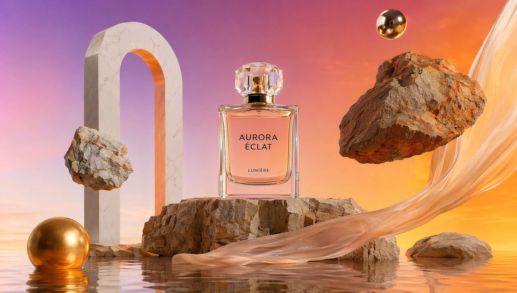
2.5 — 이끼 위의 향수 대작
저자: @Salmaaboukarr | 출처: ad-creative.md Case 148
A high-end editorial product photograph of a single luxury perfume bottle centered in a warm earthy still-life scene. The product is a clear rectangular glass bottle filled with golden amber liquid, topped with a glossy rounded black cap, with a clean white front label that reads "BYREDO", "BAL D'AFRIQUE", and "EAU DE PARFUM". Place the bottle upright on 1 curved piece of pale weathered driftwood, surrounded by a dense carpet of 1 layer of rich green moss covering the foreground and lower frame. Use a minimal studio composition with the product isolated against a smooth warm brown-to-amber gradient background, softly illuminated like sunset light. Light the scene with dramatic directional warm light from the upper right, creating a bright glow on the background, a crisp highlight on the cap, soft reflections in the glass, and gentle shadows across the wood and moss. Keep the framing vertical, the bottle centered slightly low in the composition with generous negative space above, and the overall mood natural, luxurious, earthy, cinematic, and polished like a premium fragrance campaign shot.
분석:
- 재질 표현이 계층적으로 풍부합니다. 유리 병의 반사, 병캡의 하이라이트, 부유목의 질감, 이끼의 식감. 각 표면마다 고유한 조명 지시가 있습니다.
- "generous negative space above"는 의도적인 여백으로, 잡지 배치를 위해 텍스트 공간을 남겨두는 전략입니다.
- 전체 장면은 제품 1개 + 2가지 자연 요소(부유목과 이끼)만 포함합니다. 극도로 단순한 구도로 제품을 절대 주인공으로 만듭니다.
활용: 향수 광고, 스킨케어 제품 사진, 고급 라이프스타일 브랜드
2.6 — 금색 모피 속의 향수 병
저자: @Salmaaboukarr | 출처: ad-creative.md Case 149
A luxurious editorial product photograph of a single perfume bottle nestled into dense, plush faux fur in rich golden caramel and honey-brown tones. Center the composition on one clear oval glass bottle filled with warm amber liquid, with a glossy rounded black cap and a clean white rectangular label. The label text should read {argument name="brand name" default="BYREDO"} at the top, {argument name="product name" default="BAL D'AFRIQUE"} large in the middle, and {argument name="product type" default="EAU DE PARFUM"} in small text near the bottom. Shoot it as a close-up still life with soft studio lighting, subtle highlights on the glass and cap, gentle shadows in the folds of the fur, and a warm cinematic color palette. The bottle should sit slightly embedded in the fur so the surrounding texture frames it from all sides, creating a premium fashion editorial mood, minimal composition, shallow depth of field, crisp focus on the label, and a high-end beauty campaign aesthetic.
분석:
- "slightly embedded in the fur"로 제품과 환경이 물리적 관계를 맺습니다. 단순 배치보다 훨씬 더 질감이 있습니다.
- 라벨 텍스트를
argument매개변수로 설계합니다. 모든 브랜드로 빠르게 교체 가능합니다. 템플릿 사고의 전형입니다. - "shallow depth of field, crisp focus on the label"로 초점을 명확히 합니다. 브랜드명이 항상 선명하게 보입니다.
활용: 뷰티 제품 촬영, 이커머스 메인 이미지, 소셜 미디어 광고 소재
장면 3: 음식 및 음료 광고
식품 광고의 핵심은 "먹고 싶은 욕구"입니다. 이 프롬프트 모음은 일본식 외식 전단부터 고급 초콜릿 브랜드까지 다양한 스타일을 포함합니다. GPT Image 2가 식품 질감, 패키징 디자인, 생활감이 넘치는 장면 구성을 어떻게 처리하는지 보여줍니다.
3.1 — 일식 중화 요리 외식 전단
저자: @xc5_ | 출처: ad-creative.md Case 166
A Japanese neighborhood Chinese restaurant delivery flyer for mailbox posting (3:4 aspect ratio). Designed to look like a double-sided B5 print.

Flyer characteristics (following the grammar of real delivery flyers):
- Flashy red and yellow color scheme.
- Large text at the top: "Delivery Available! {argument name="shop name" default="Mona-Hanten"}" (shadowed Gothic font).
- An illustration of a {argument name="character" default="Chinese girl in a red cheongsam with a brown short bob"} holding ramen and saying "Welcome!" in a speech bubble.
- A menu photo grid (4x3) featuring various dishes: different types of ramen, fried rice, gyoza, sweet and sour pork, shrimp in chili sauce, mapo tofu, liver and leek stir-fry, tenshinhan, twice-cooked pork, spring rolls, annin tofu, and fried rice sets.
- Names and prices for each dish.
- A large yellow banner saying "Free delivery on all menu items over ¥1,000!".
- "Order by phone! ☎ 072-XX-XXXX" emphasized with a red circle.
- Business hours "11:00-22:00 (Closed on Tuesdays)".
- Delivery area map (simple schematic map).
- Coupon (perforated line for clipping): "One free plate of gyoza with this flyer!".

Texture of cheap paper printing. Includes fold marks. Precision that could be mistaken for a real Japanese delivery flyer.
분석:
- "following the grammar of real delivery flyers"라는 문장이 핵심입니다. AI에게 "멋진" 포스터가 아니라 실제 전단의 시각 문법을 모방하라고 지시합니다.
- 세부 사항이 극도로 정확합니다. 저가 종이 질감, 접힘 자국, 쿠폰의 절취선까지 포함합니다. 전화번호의 빨간 원 강조도 있습니다.
- 4x3 메뉴 네트워크는 12개의 구체적인 요리를 나열합니다. 각 칸에 명확한 내용이 있습니다.
활용: 외식 배달 전단, 지역화 마케팅 물료, 인쇄물 모의 제작
3.2 — 풍자 럭셔리 제품 광고
저자: @tonysimons_ | 출처: ad-creative.md Case 131
High-impact parody e-commerce infographic for "{argument name="product" default="Four Loko"}" malt beverage. Foreground: An extreme close-up of a rough, weathered hand holding a tall, brightly colored can of {argument name="product" default="Four Loko"} toward the camera. The can is slightly cold with visible condensation droplets and a loud, chaotic flavor design. The hand and can have a slight macro-lens blur for depth, with the can still reading clearly as the hero product. Central Subject: In the mid-ground, a funny, disheveled {argument name="subject" default="homeless-looking man"} sitting casually on a milk crate in an urban alley. He has a scruffy beard, messy hair, layered worn clothing, and a huge unbothered grin. He should look chaotic but oddly charismatic, like the accidental king of bad decisions. He is posed like a confident lifestyle-ad model, proudly showing off the can. Background & Lighting: A ridiculously polished ad-style backdrop mixed with a grimy city alley setting. Soft-focus urban textures, dumpster shapes, graffiti hints, and scattered clutter in the distance. Add dramatic studio lighting, soft glow, rainbow prism flares, and subtle light leaks to make the whole thing look way too premium for the subject matter. A few blurred {argument name="product" default="Four Loko"} cans can float artistically in the background for extra absurdity. Typography & Layout (Bold sans-serif, white and neon accent styling): Top Center (Background): Massive, bold text reading "{argument name="brand name" default="FOUR LOKO"}" positioned behind the subject. Top Right: Bold text reading "The Champagne of Bad Ideas". Mid-Left: "Premium chaos and zero self-control" Mid-Right: Large, bold "23" with the text "ounces of terrible decisions." Bottom-Right: Large, bold "1" with the text "can to ruin tomorrow." Optional small callout text near the bottom: "Now with more regret." Style: Ultra-detailed, 8k parody commercial photography, sharp focus on the can, shallow depth of field, vibrant trashy color palette, clean advertising composition, exaggerated premium product-ad aesthetic, funny visual contrast between polished branding and the wrecked subject.
분석:
- 광고의 유머는 대비에서 비롯됩니다. 럭셔리 제품 수준의 조명과 배치를 사용해서 "형편없는 제품"을 포장합니다. 황당한 코미디 효과가 생깁니다.
- 3단계 깊이 설계(전경 손+캔, 중경 인물, 배경 환경)로 영화 감각이 생깁니다.
- "rainbow prism flares"와 "floating cans"는 과도한 포장 기법을 사용해서 풍자 효과를 강화합니다.
활용: 소셜 미디어 밈 광고, 풍자 마케팅, 브랜드 해체 스타일 크리에이티브
3.3 — 고급 초콜릿 브랜드 광고
저자: @SPEEDAI07 | 출처: ad-creative.md Case 169
Create a premium, square (1:1) product advertisement for a fictional luxury chocolate brand called Noirvelle Chocolat, inspired by high-end chocolate brands. The ad should feel like a high-end editorial campaign, combining luxury food photography, refined packaging design, and cinematic lighting. Use matte black wrapper, subtle gold foil, elegant serif typography, and realistic product rendering. Generate flavor variants such as Blood Orange Noir, Salted Pistachio Muse, and Raspberry Ember with distinct mood, color palette, ingredients, headline, and supporting copy. Keep the chocolate bar as hero centerpiece with subtle reflections, shallow depth of field, luxury minimalism, and a small CTA: "Shop the drop."
분석:
- 프롬프트가 짧지만, 핵심 키워드 선택이 매우 정확합니다. matte black, gold foil, serif typography 세 단어로 고급 초콜릿 브랜드의 전체 시각 언어를 잠금 장치합니다.
- "distinct mood, color palette"로 AI가 각 맛마다 다른 톤을 생성하도록 지시합니다. 시리즈감을 만듭니다.
- "Shop the drop"이라는 CTA는 패션 브랜드의 한정판 발매 용어입니다. 초콜릿도 거리 문화의 쿨한 감각을 얻습니다.
활용: 식품 브랜드 광고, 고급 패키징 디자인 컨셉, 이커머스 제품 페이지
3.4 — 도시 주스 광고 포스터
저자: @AIwithSarah_ | 출처: ad-creative.md Case 170
Create a premium modern beverage advertisement poster in a vertical 3:4 format featuring a stylish young female model crouching confidently in a bright urban indoor hallway with colorful graffiti wall art on one side and clean minimal architecture on the other. In the foreground, a giant realistic fruit juice bottle is held toward the camera in forced perspective, with fictional branding like "VIVAJUICE". Add brand logo, tagline, huge bold overlapping typography, four icon-based feature badges, and three smaller bottle variants at bottom right. Use soft natural lighting mixed with commercial studio polish, realistic shadows, shallow depth of field, glossy floor reflections, and a premium energetic eCommerce campaign aesthetic.
분석:
- "forced perspective"는 강조 원근법으로 과일 주스 병이 화면 중심을 차지하게 합니다. 음료 광고의 고전 구도입니다.
- 장면 디자인이 명확한 대비를 만듭니다. 한쪽은 낙서 벽, 다른 한쪽은 극소주의 건축. 시각적 긴장이 생깁니다.
- 하단에 3개의 작은 병 변형을 배열합니다. 실제 이커머스 페이지의 SKU 전시 논리를 모방합니다.
활용: 음료 브랜드 포스터, 이커머스 배너, 옥외 광고 시각
장면 4: 기술 제품과 공간 전시
기술 제품 광고는 "멋짐"과 "정보량"을 동시에 충족해야 합니다. 미래감의 시각적 충격과 제품 특성의 명확한 전달이 모두 필요합니다. 이 프롬프트 모음은 UI 컨셉 초안부터 제품 분해도, 축소 도시부터 가상 AI 기기까지 다양한 기술 광고 스타일을 보여줍니다.
4.1 — 다크 모드 마케팅 케이스 UI
저자: @IndieDevHailey | 출처: ad-creative.md Case 108
{
  "type": "UI/UX landing page mockup",
  "theme": "dark mode, sleek modern aesthetic, glassmorphism, {argument name=\"primary accent color\" default=\"neon purple and blue\"} glowing accents",
  "header": {
    "logo": "{argument name=\"brand name\" default=\"goViralX\"}",
    "top_right_tag": "VIRAL CAMPAIGN CASE STUDY"
  },
  "layout": {
    "sections": [
      {
        "name": "Hero",
        "headline": "{argument name=\"hero headline\" default=\"How We Created 10M+ Viral Impact\"}",
        "subheadline": "3일 안에 전국 범위에서 폭발, 브랜드 지수 성장 지원",
        "stats_row": {
          "count": 4,
          "labels": ["총 조회수", "상호작용률", "변환 상담", "실행 기간"],
          "values": ["{argument name=\"main statistic\" default=\"10,240,000+\"}", "18.7%", "3,200+", "72시간"]
        },
        "visual": "cinematic shot of a person in a hoodie looking at glowing digital screens and graphs, large play button overlay"
      },
      {
        "name": "Strategy",
        "title": "3일 실행 전략",
        "layout_type": "vertical timeline",
        "steps_count": 3,
        "elements_per_step": ["timeline node", "title", "bullet points", "video thumbnail with play button", "description box"]
      },
      {
        "name": "Performance",
        "title": "데이터 기반 성과",
        "left_column": {
          "stat_cards_count": 4,
          "values": ["10M+", "43%", "28,000+", "3,200+"]
        },
        "right_column": {
          "charts_count": 2,
          "chart_1": "line graph showing 7-day growth peaking at Day 3",
          "chart_2": "horizontal segmented bar chart showing platform distribution (TikTok 52%, Instagram 24%, X 15%, YouTube 9%)"
        }
      },
      {
        "name": "Keys to Success",
        "title": "바이럴 성공의 3가지 핵심",
        "cards_count": 3,
        "card_elements": ["glowing icon (fire, target, antenna)", "title", "description", "VIEW DETAIL link"]
      },
      {
        "name": "Social Proof",
        "title": "제작자 및 브랜드 신뢰",
        "left_column": {
          "logos_count": 8,
          "grid": "2x4",
          "brands": ["SHEIN", "SHOPLINE", "Blueglass", "instacart", "lemon8", "mi", "CIDER", "bellroy"]
        },
        "right_column": {
          "testimonial_cards_count": 2,
          "elements": ["quote", "author title (SaaS Founder, Growth Manager)"]
        }
      },
      {
        "name": "Call to Action",
        "title": "바이럴 준비되셨나요?",
        "interactive_elements": ["text input field", "glowing button with text '{argument name=\"call to action text\" default=\"전용 성장 솔루션 얻기 ->\"}'"],
        "visual": "3D render of a rocket ship taking off with purple and blue flames"
      }
    ]
  }
}
분석:
- 완전한 랜딩 페이지 구조입니다. Hero, 전략, 데이터, 성공 요소, 사회 증거, CTA. 표준 마케팅 페이지 정보 아키텍처입니다.
- 데이터 시각화 설명이 매우 구체적입니다. "line graph showing 7-day growth peaking at Day 3". AI가 어떤 추세를 표시할지 알게 됩니다.
- glassmorphism 스타일 + 네온 톤. 2024-2026년 가장 주류인 SaaS 시각 언어를 만듭니다.
활용: SaaS 제품 랜딩 페이지 컨셉, 마케팅 케이스 전시, 브랜드 솔루션 제안
4.2 — VR 헤드셋 폭발 분해도
저자: @wory37303852 | 출처: ad-creative.md Case 109
{
  "type": "exploded view product diagram poster",
  "subject": "VR headset",
  "style": "clean high-tech 3D render, studio lighting, glowing accents",
  "background": "{argument name=\"background color\" default=\"soft purple and blue gradient\"}",
  "header": {
    "logo": "∞ {argument name=\"product name\" default=\"Meta Quest 3\"}",
    "subtitle": "{argument name=\"main catchphrase\" default=\"まったく新しい現実を、まったく新しい構造から。\"}"
  },
  "layout": {
    "centerpiece": "vertically stacked exploded view of a VR headset showing 9 distinct layers of internal components: outer shell, camera sensors, motherboard with chip, pancake lenses, internal frame, battery packs, side straps, top strap, and facial interface cushion.",
    "callout_labels": {
      "count": 8,
      "left_side": [
        "Snapdragon® XR2 Gen 2\n圧倒的な処理性能でリアルタイムな体験を。",
        "調整可能なIPD機構\n幅広いユーザーに快適なフィット感を。",
        "精密設計されたヘッドストラップ\n快適さと安定性を追求したエルゴノミクス。"
      ],
      "right_side": [
        "フェイスプレート\n洗練されたデザインと最適な重量バランス。",
        "トラッキングカメラ\n高精度な位置トラッキングと環境認識を実現。",
        "パンケーキレンズ\n薄型設計で広い視野角と鮮明な映像を提供。",
        "高性能バッテリー\n長時間駆動を支える最適化された電源設計。",
        "柔らかなフェイスインターフェース\n長時間でも快適な装着感を実現。"
      ]
    },
    "footer": {
      "left_text_block": {
        "headline": "{argument name=\"bottom headline\" default=\"体験は、構造から進化する。\"}",
        "body": "일부분씩, 몰입 체험을 지원하는 최첨단 기술과 こだわりの설계. Meta Quest 3는 내부에서 미래의 체험을 만들어내고 있습니다."
      },
      "right_logo": "∞ Meta"
    }
  }
}
분석:
- 9단계 분해 구조가 외부 케이스부터 면 패드까지 각 계층을 표시합니다. 산업 디자인 전시의 전형입니다.
- 좌우 분포의 콜아웃 라벨(좌 3개, 우 5개)은 정보량이 많지만 쌓여 보이지 않습니다.
- 일본어 프롬프트의 서술 스타일을 배울 가치가 있습니다. 먼저 개념, 다음 화면, 마지막 모든 텍스트 요소. 계층이 명확합니다.
활용: 기술 제품 발표회 물료, 제품 상세 페이지, 크라우드펀딩 페이지 메인 시각
4.3 — 럭셔리 축소 두바이 도시 모델
저자: @silentempiredev | 출처: ad-creative.md Case 150
A hyper-detailed cinematic isometric miniature city model of {argument name="landmark tower" default="Burj Khalifa"} rising dramatically from the center of a square architectural master-plan board, presented like a luxury urban planning maquette on a black background. The composition shows one dominant ultra-tall silver skyscraper in the exact center, surrounded by a dense ring of modern high-rise towers, illuminated roads, bridges, and glowing warm city lights. Curving turquoise-blue water features and artificial lakes wrap around the central district in multiple connected pools and canals, with one large circular fountain-like feature near the tower base and several small island shapes visible in the water. In the lower right quadrant, include a large low-rise complex with rounded geometric roofs and subtle green-lit sections, connected by multilane roads and looping interchanges. The entire city sits on one square beige map board engraved with faint street grids and planning lines, with the board edges clearly visible and slightly raised. Viewpoint is a high three-quarter isometric angle, centered and symmetrical, with the tower extending far upward into negative space. Lighting is dramatic and luxurious: warm golden edge lights on buildings and roads, cool reflections in the water, crisp metallic highlights on the central tower, and a deep black void surrounding the model. Style should feel like a photorealistic architectural visualization mixed with a premium collectible scale model, extremely intricate, sharp, polished, and elegant.
분석:
- 등각 뷰(isometric) + 축소 모델 스타일로 복잡한 도시 계획을 한눈에 이해 가능하게 합니다.
- 수체 설명이 매우 풍부합니다. "turquoise-blue water features", "connected pools and canals", "circular fountain". 계층화된 파란색 요소를 형성합니다.
- "square beige map board engraved with faint street grids"로 도시를 계획 하판 위에 놓습니다. 건축 전문성을 증가시킵니다.
활용: 부동산 프로젝트 전시, 도시 계획 컨셉 그래픽, 건축 사무소 제안
4.4 — 가상 AI 광고 프린터 포스터
저자: @nijisora_yuma | 출처: ad-creative.md Case 168
縦型3:4の、高級商業ポスターを制作してください。

テーマは、架空の新商品広告です。商品は「BRAND PRESS 01(ブランドプレス・ゼロワン)」という、Pollo AIを搭載した架空の広告ポスター生成プリンターです。

この商品は、まだ存在しないブランド名・商品ジャンル・世界観・ターゲット層を入力すると、Pollo AIがコピー、ビジュアル、レイアウトまで完成された商業広告ポスターを自動生成し、高精細な印刷物としてその場で出力する未来型プリンターです。単なるAIサービスの概念広告ではなく、実際に販売されていそうな架空商品の広告として成立させてください。

メインコンセプト: 「まだないブランドに、最初の一目惚れを。」

商品ビジュアル: 画面中央に実物の商品「BRAND PRESS 01」を大きく配置。未来型の高級プロ用印刷デバイスとして、黒い金属筐体、シルバーのエッジ、透明カバー、青白く発光するAIコア、精密な印刷ヘッド、ローラー、タッチパネル、排紙スロット、ポスター受けトレイを備える。排紙スロットから、架空の高級香水ブランド広告ポスターが紙として大きく出力されている構図。

構図: ややローアングル、斜め45度。背景は暗いネイビーから黒の高級広告制作スタジオ。映画的でドラマチックな高級プロダクト広告。

広告レイアウト: 上部に大きなキャッチコピー、中央にプリンター本体と排出中のポスター、右側に機能説明、左下に価格と発売日、下部にCTA。

入れる文字: 「まだないブランドに、最初の一目惚れを。」 / BRAND PRESS 01 / 「Pollo AI搭載・広告ポスター生成プリンター」 / 「名前だけのアイデアを、完成された商業ポスターとして出力。」 / 「構想、コピー、ビジュアル、印刷まで。1台で。」
분석:
- "광고 속의 광고"입니다. 광고 포스터를 생성할 수 있는 가상 제품을 광고 포스터로 광고합니다. 메타 서사의 재미가 있습니다.
- 제품 설명이 매우 구체적입니다. 검정 금속 기계, 은색 모서리, 투명 커버, 청백색으로 빛나는 AI 코어. 각 부품이 명확한 시각 지시를 받습니다.
- 일본어 프롬프트의 서술 스타일을 배울 만합니다. 먼저 개념을 설명하고, 다음 화면을 설명하고, 마지막 모든 텍스트 요소를 나열합니다. 계층이 분명합니다.
활용: 기술 제품 출시 포스터, 컨셉 광고, CES 전시회 물료
장면 5: 크리에이티브 컨셉과 크로스오버 디자인
일부 광고는 상식을 따르지 않습니다. 예상 밖의 크리에이티브 컨셉으로 시선을 끈다는 것입니다. 이 프롬프트 모음은 다중 패널 광고 네트워크와 마법 현실주의 제품 장면을 보여줍니다. 복잡한 크리에이티브 개념을 처리하는 GPT Image 2의 능력을 증명합니다.
5.1 — 4칸격 일식 디지털 광고
저자: @makaneko_AI | 출처: ad-creative.md Case 90
{
  "type": "2x2 grid of Japanese digital advertisement banners",
  "layout": {
    "structure": "4 equal quadrants",
    "quadrants": [
      {
        "position": "top-left",
        "theme": "Travel",
        "subject": "A couple holding hands on a white sand beach, looking out at turquoise ocean water under a bright blue sky.",
        "elements": ["red hibiscus flower in bottom left corner"],
        "text_labels": [
          "今年こそ、解き放て。",
          "{argument name=\"travel destination\" default=\"沖縄旅行\"}",
          "3日間の癒やし旅",
          "航空券+ホテル",
          "39,800円〜",
          "絶景、グルメ、体験 ぜんぶ叶う!"
        ],
        "icons": {
          "count": 3,
          "descriptions": ["airplane", "hotel building", "car"]
        }
      },
      {
        "position": "top-right",
        "theme": "Skincare",
        "subject": "Close-up portrait of a young woman with glowing, dewy skin, eyes closed, gently touching her cheeks.",
        "elements": [
          "soft pink gradient background",
          "dynamic water splash effects",
          "pink cosmetic jar labeled '{argument name=\"skincare product name\" default=\"LUMIÈRE\"} Brightening Gel'"
        ],
        "text_labels": [
          "毛穴・くすみ卒業!",
          "透明感あふれる",
          "水光肌へ",
          "新感覚スキンケア",
          "初回限定 78%OFF",
          "{argument name=\"discount price\" default=\"1,980円\"}"
        ],
        "badges": {
          "count": 3,
          "style": "gold circular",
          "labels": ["毛穴ケア", "高保湿", "ハリ・ツヤ"]
        }
      },
      {
        "position": "bottom-left",
        "theme": "Gourmet Food",
        "subject": "Thick, sliced, medium-rare steak sizzling on a dark grill plate.",
        "elements": [
          "garlic chips",
          "rosemary sprig",
          "dark background with smoke and glowing embers"
        ],
        "text_labels": [
          "とろける旨さ!",
          "{argument name=\"food item\" default=\"黒毛和牛\"}",
          "贅沢ステーキ",
          "期間限定",
          "特別価格",
          "通常価格 8,980円",
          "4,980円"
        ],
        "badges": {
          "count": 1,
          "style": "red circular",
          "labels": ["A4 A5等級"]
        }
      },
      {
        "position": "bottom-right",
        "theme": "Online Education",
        "subject": "Young man in a blue shirt studying at a desk, writing in a notebook next to an open laptop.",
        "elements": ["bright indoor lighting", "desk environment"],
        "text_labels": [
          "スキマ時間で",
          "{argument name=\"education goal\" default=\"最短合格!\"}",
          "オンライン資格講座",
          "スマホで完結",
          "効率学習で差がつく!",
          "今だけ! 受講料 20%OFF"
        ],
        "badges": {
          "count": 1,
          "style": "blue circular",
          "labels": ["受講者数 10万人 突破!"]
        },
        "icons": {
          "count": 2,
          "descriptions": ["smartphone", "open book"]
        }
      }
    ]
  }
}
분석:
- 한 개의 프롬프트로 4가지 완전히 다른 산업의 광고를 생성합니다(여행, 스킨케어, 미식, 교육). JSON 구조화의 강력한 제어력을 보여줍니다.
- 각 사분면마다 독립적인 subject, elements, text_labels, badges/icons가 있습니다. 상호 간섭이 없습니다.
argument매개변수로 각 광고의 핵심 요소를 빠르게 교체할 수 있습니다. 무한한 변형을 형성합니다.
활용: 광고 플랫폼 디스플레이 템플릿, 다중 카테고리 이커머스 이벤트 페이지, 디자인 능력 시연
5.2 — 마법의 씨앗 패킷 3D 장면
저자: @AllaAisling | 출처: ad-creative.md Case 143
Epic 3D scene: a weathered seed packet lying open on a potting bench, its promise erupting into the garden it describes. The illustration on the front becomes real. {argument name="plant type" default="[PLANT / FLOWER]"} growing at full scale from the paper, roots visible through the packet's base pushing into soil below.
{argument name="detail left" default="[DETAIL 1]"} in full bloom at one corner. {argument name="detail right" default="[DETAIL 2]"} mid-growth at the other, not yet what it will be.
Tiny insects that belong to this plant, {argument name="insect type" default="[BEE / BUTTERFLY / BEETLE]"}, hovering at correct scale.
The written instructions on the back become garden calendar, "sow in spring" manifests as actual spring light. "full sun" manifests as a single shaft of it, hitting the tallest bloom perfectly.
Scattered seeds between packet and soil each showing their germination stage, split coat, first root, first shoot, first leaf.
The packet's torn top edge becomes a treeline.
Potting bench surface with soil scatter and water droplets.
Tilt-shift depth of field, greenhouse morning light, the packet as the garden it always intended.
분석:
- 핵심 크리에이티브는 "평면에서 입체로의 변환"입니다. 씨앗 패킷의 그림이 진정한 식물로 자라납니다. 이것은 마법 현실주의 광고 기법입니다.
- "sow in spring manifests as actual spring light"는 텍스트 설명을 시각적 현실로 변환합니다. 매우 시적입니다.
- 씨앗의 발아 단계 전시(split coat, first root, first shoot, first leaf)는 미니 생명 주기 인포그래픽 같습니다.
활용: 정원 브랜드 광고, 유기농 식품 패키징 컨셉, 자연 테마 브랜드 스토리
광고 크리에이티브 프롬프트 만능 템플릿
다음은 19개 사례에서 추출한 재사용 가능한 템플릿입니다. 대괄호 안의 내용을 바꾸면 됩니다:
템플릿 1: 제품 클로즈업 광고
A high-end editorial product photograph of [제품 설명] centered in [장면 설명].
Use [재질/소품] as supporting elements. Light the scene with [광선 방향과 유형],
creating [구체적인 빛과 그림자 효과]. Color palette: [3-5개 색상].
Overall style: [사진 스타일], [브랜드 톤], [구도 특징].
템플릿 2: JSON 구조화 브랜드 물료
{
  "type": "[물료 유형, 예: brand identity board / product poster]",
  "theme": "[주 색상] and [보조 색상], [스타일 키워드]",
  "layout": {
    "sections": [
      {"type": "[영역 유형]", "position": "[위치]", "elements": ["[요소1]", "[요소2]"]}
    ]
  }
}
템플릿 3: 패션 광고 포스터
A [형용사] vertical fashion campaign poster featuring [인물 설명] in [자세]
against [배경 설명]. The model wears [의류 세부]. Her/His face is obscured
by [가리기 방식]. Behind, [텍스트 배치 설명]. Color palette: [색상 설명] with
[후처리 효과]. Overall style: [광고 스타일], [시대 참고], [브랜드 질감].
템플릿 4: 식품/음료 광고
Create a premium [화폭 비율] [광고 유형] for [브랜드/제품명].
Feature [식품/음료 설명] as hero centerpiece with [촬영 기법].
Add [패키징 디자인 요소], [텍스트 배치], and [행동 촉구].
Use [광선 설명] and [톤 설명]. Style: [참고 스타일].
핵심 기법 요약
| 기법 | 설명 | 전형 사례 |
|---|---|---|
| JSON 구조화 | JSON 형식으로 다중 영역 레이아웃, 요소 개수, 위치 관계를 정확히 제어합니다. | Case 90, 107, 112 |
| 매개변수화 설계 | {argument} 자리 표시자를 사용하여 프롬프트를 재사용 가능한 템플릿으로 만듭니다. | Case 144, 149, 170 |
| 전문 조명 용어 | specular highlight, rim lighting, shallow depth of field 등 실제 사진/후처리 용어를 사용합니다. | Case 144, 145, 148 |
| 얼굴 흐림 처리 | "face obscured by rectangular blur block"로 얼굴 품질 문제를 피하면서 패션감을 강화합니다. | Case 145, 146, 147 |
| 정확한 개수 제어 | 로고 개수, 제품 개수, 아이콘 개수를 명시적으로 지정합니다. AI의 자유로운 해석을 방지합니다. | Case 112, 145, 166 |
| 스타일 고정 | 구체적인 시대, 브랜드, 매체를 시각적 참고 좌표로 사용합니다. | Case 147, 131, 169 |
결론
이 19개 광고 크리에이티브 프롬프트는 브랜드 VI부터 제품 사진까지, 거리 패션부터 고급 럭셔리까지 광범위한 장면을 다룹니다. 모두 공통점이 하나 있습니다. "광고 디자인"이라는 일을 AI가 이해할 수 있는 정확한 지시로 분해한 것입니다. JSON 구조화 레이아웃이든, 전문 사진 용어든, 매개변수화 템플릿 설계든, 이런 기법들이 GPT Image 2를 단순히 "이미지 생성" 도구가 아니라, 광고 크리에이티브 프로세스에서의 진정한 생산성 도구로 만들었습니다.
물론 현재 AI가 생성하는 광고 이미지가 전문 디자인 팀을 완전히 대체할 수는 없습니다. 특히 브랜드 일관성, 다중 반복, 생산 수준의 결과물에서는 여전히 격차가 있습니다. 그러나 크리에이티브 탐색, 솔루션 제안, 빠른 프로토타입의 도구로 봤을 때, 효율성은 이미 놀라운 수준입니다.
모든 프롬프트는 오픈소스 프로젝트 awesome-gpt-image-2-prompts에서 비롯되었습니다. 모든 기여자의 공유에 감사합니다. 더 나은 광고 크리에이티브 프롬프트가 있으시면 저장소에 PR을 제출해 주세요.
Written with pixocto · Images generated by GPT Image 2