AIポスターのタイポグラフィ設計ガイド:文字を主役にする6つのスタイル
同じ単語でも、書体が変われば表現も変わる——タイポグラフィそのものがビジュアル言語です
AIポスターのタイポグラフィ設計ガイド:文字を主役にする6つのスタイル
 同じ単語でも、書体が変われば表現も変わる——タイポグラフィそのものがビジュアル言語です
タイムラインの中で、書体は注意を引く力そのものです。
思わず指を止めてしまうポスターを思い出してみてください。画面を貫く巨大な文字、あるいは情景に溶け込んだコピー。良いタイポグラフィなくして、良いポスターはない——これはブランドデザイナーの共通認識であり、AIポスター生成が最もつまずきやすいポイントでもあります。
GPT Image 2の文字レンダリング技術の進化により、AIは初めて「デザイン指示通り」に複雑な組版を再現できるようになりました。本記事ではGitHubコミュニティからタイポグラフィ主導のプロンプト6選を厳選しました(awesome-gpt-image-2、awesome-gpt-imageから)。シュルレアリスム、古典、情報密集、レトロ、ファッション、未来——6つのトーンを網羅し、それぞれに再現可能なテクニックがあります。
スタイル1:超大透視タイポグラフィ——文字をシーンに塗り込む
文字を画面に「浮かせる」のではなく、シーンと物理的に融合させる手法です。
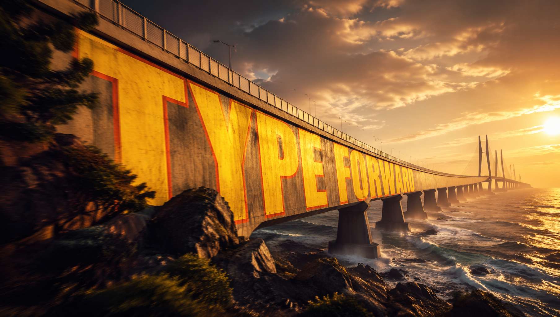 海をまたぐ橋に描かれた巨大な文字が、橋面のカーブに沿って自然に変形——映画ポスターのようなビジュアルインパクト。プロンプト提供:@xpg0970
コミュニティプロンプト(@xpg0970):
Scene: Side view of a cross-sea bridge, dramatic cinematic angle. Giant bold sans-serif text "[text]" painted onto the surface of the bridge, progressively foreshortened from near to far end, letterforms conforming to surface curvature, surface-integrated not floating. Text partially occluded by foreground elements, creating depth-layering effect. Oversized bright yellow + sharp orange outline, extreme perspective distortion aligned to vanishing point. Cinematic lighting, motion blur, poster-grade dynamic integrated typography, modern advertising aesthetics.
ポイント:
letterforms conforming to surface curvature—— 文字が表面のカーブに沿って変形する(平面貼り付けではない)surface-integrated not floating—— 表面と一体化させ、浮かせないextreme perspective distortion aligned to vanishing point—— 極端な遠近法で消失点へ収束partially occluded by foreground elements—— 前景要素で一部を遮り、空間の奥行きを演出
用途:映画ポスター、スポーツブランド広告、都市プロモーション映像のビジュアル
スタイル2:中国書道の手稿——AIで再現する千年の筆致
GPT Image 2の中国書道理解は飛躍的に向上し、「古典手稿の再現」が現実のものとなりました。
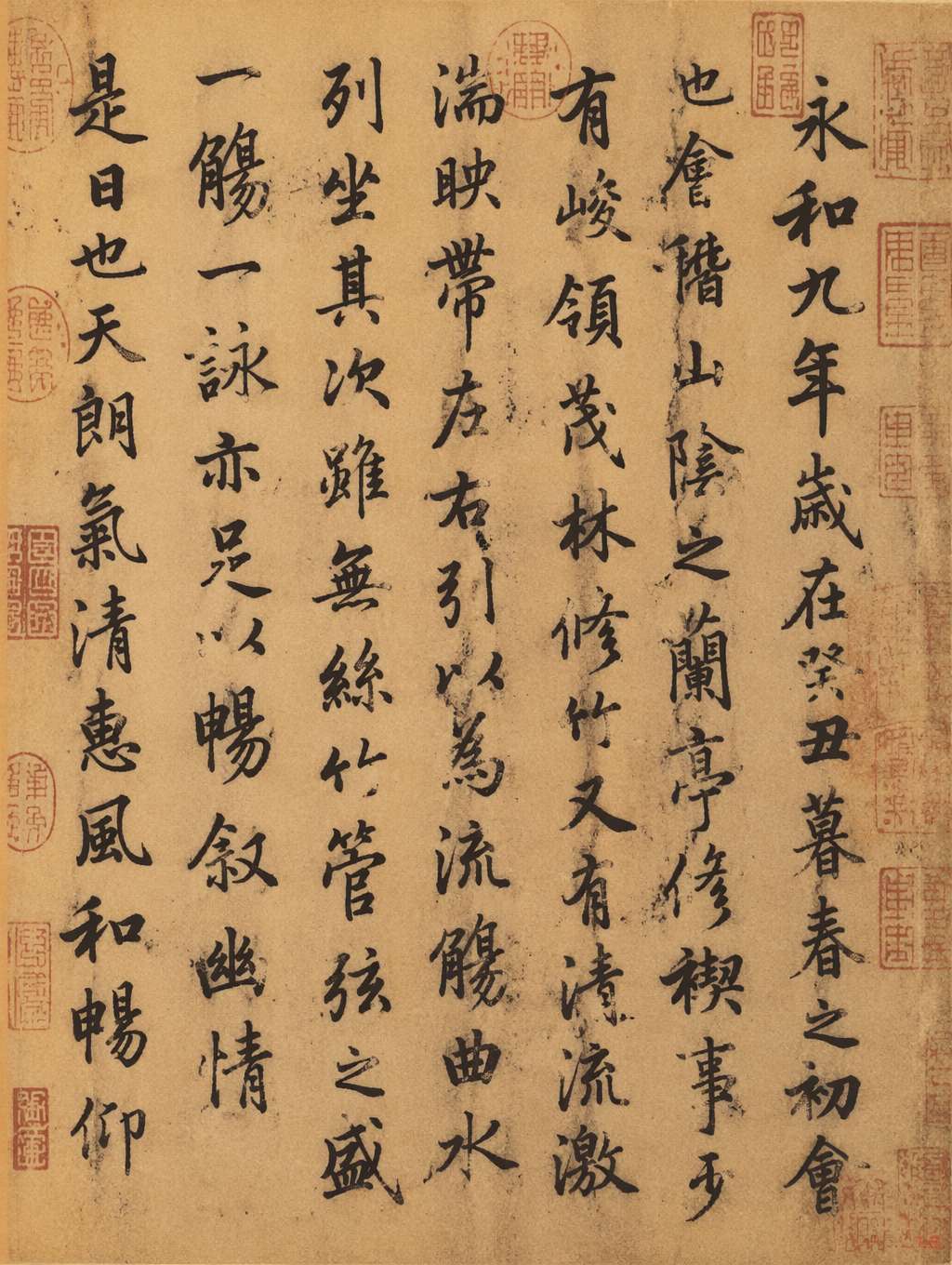 『蘭亭序』風の手稿。王羲之の行書筆致、黄褐色の宣紙に朱色の印章。プロンプト提供:@MrLarus
コミュニティプロンプト(@MrLarus):
Generate an image of the authentic manuscript of [classic text title], and incorporate the emotional core of the work into the calligraphy.
応用——スタイル指定を追加:
in Wang Xizhi style—— 王羲之スタイル(行書の流麗さ)in Yan Zhenqing style—— 顔真卿スタイル(楷書の力強さ)with stronger emotional expression—— 感情表現を強調on aged xuan rice paper with red seal stamps—— 黄褐色の宣紙に朱印
ポイント:
- 作品名そのものを「スタイル=感情」のヒントとして使う——AIは作品の情感を筆致に反映します
- 媒体(宣紙/絹本/竹簡)を明記するとリアリティが大きく向上します
- 「印章/題跋/墨のにじみ」を加えると古美術らしさが増します
用途:文化ブランド、文化グッズ、博物館ポスター、和風・東洋ファンタジーゲームのビジュアル
スタイル3:情報密集型ポスター——書道+図表+シンボル
組版能力が最も問われるタイプです。大量の小さな文字、対称レイアウト、シンボリックな要素を駆使します。
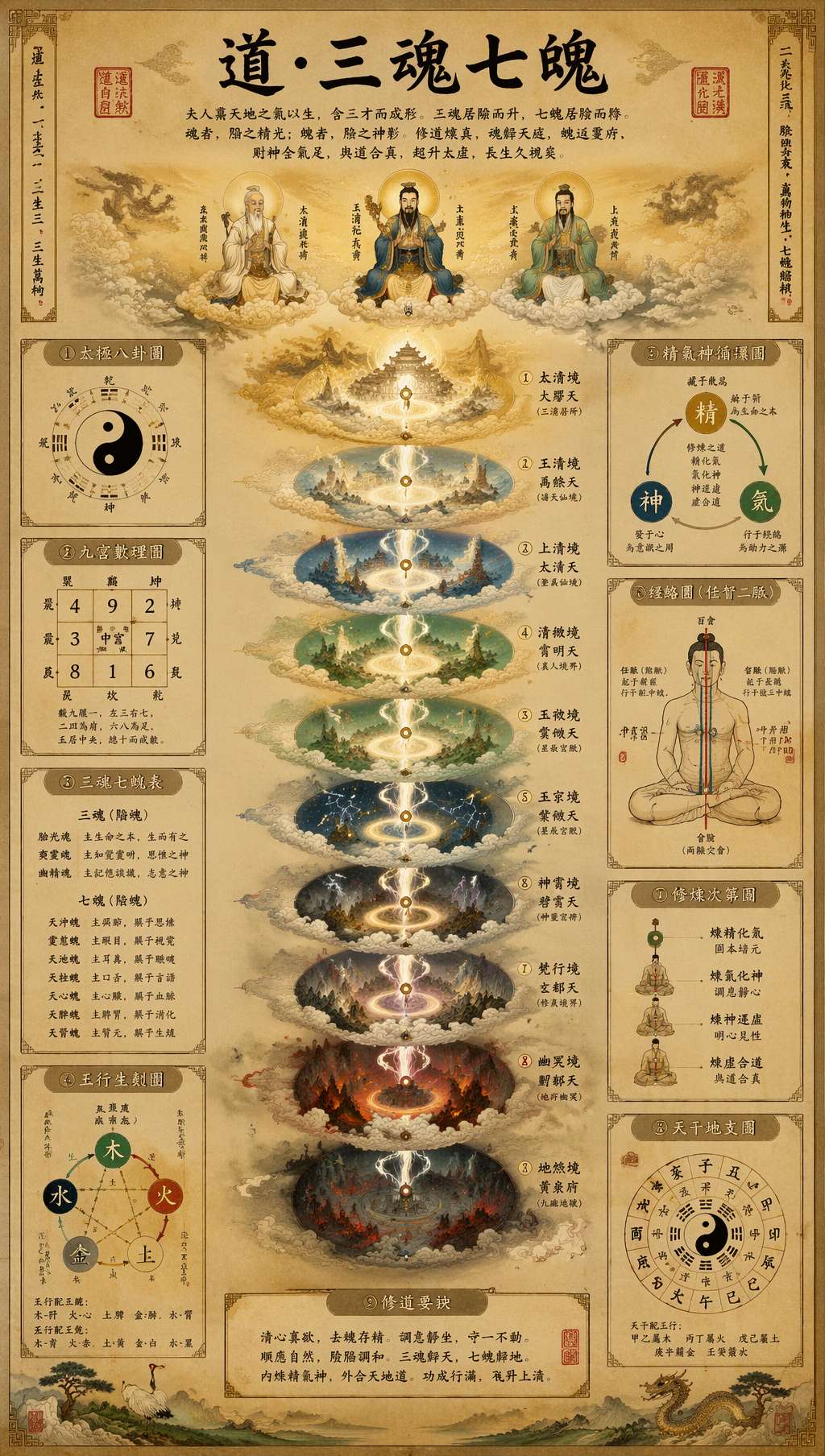 道教の手稿風インフォグラフィック。書道タイトル+多層図表+古文字注釈+朱印。プロンプト提供:@leyu37829
コミュニティプロンプト(@leyu37829、抜粋):
A highly detailed vertical Taoist esoteric infographic poster in the style of an ancient Chinese religious scroll, printed on aged beige rice paper. At the top center, large black brush-calligraphy title text reads "道·三魂七魄". The composition is perfectly symmetrical and centered on a glowing vertical spiritual axis. Around the central column, include 9 labeled side panels and diagrams in traditional Chinese layout: bagua, yin-yang, soul lists, five-elements diagram, essence-qi-spirit cycle, meridian body diagram. Use many small Chinese labels throughout, with classical seal stamps in red. Museum-quality Daoist metaphysical chart, ultra intricate, hand-painted gongbi plus ink wash illustration.
ポイント:
perfectly symmetrical, centered on a vertical axis—— 中軸対称で、宗教儀式のような荘厳さを演出9 labeled side panels and diagrams—— 具体的な数を指定するとAIがその数に合わせて配置Use many small Chinese labels throughout—— 大量の小さな注釈を強制classical seal stamps in red—— 朱印を視覚的なアンカーとして配置
用途:知識系ブロガーの情報カード、文化解説ポスター、Pinterest用の縦長画像、博物館展示物
スタイル4:レトロプロパガンダ書体——赤金二色の力強さ
1980年代のレトロ書体が再来——力強く、熱く、強烈なイデオロギー的視覚記憶を伴います。
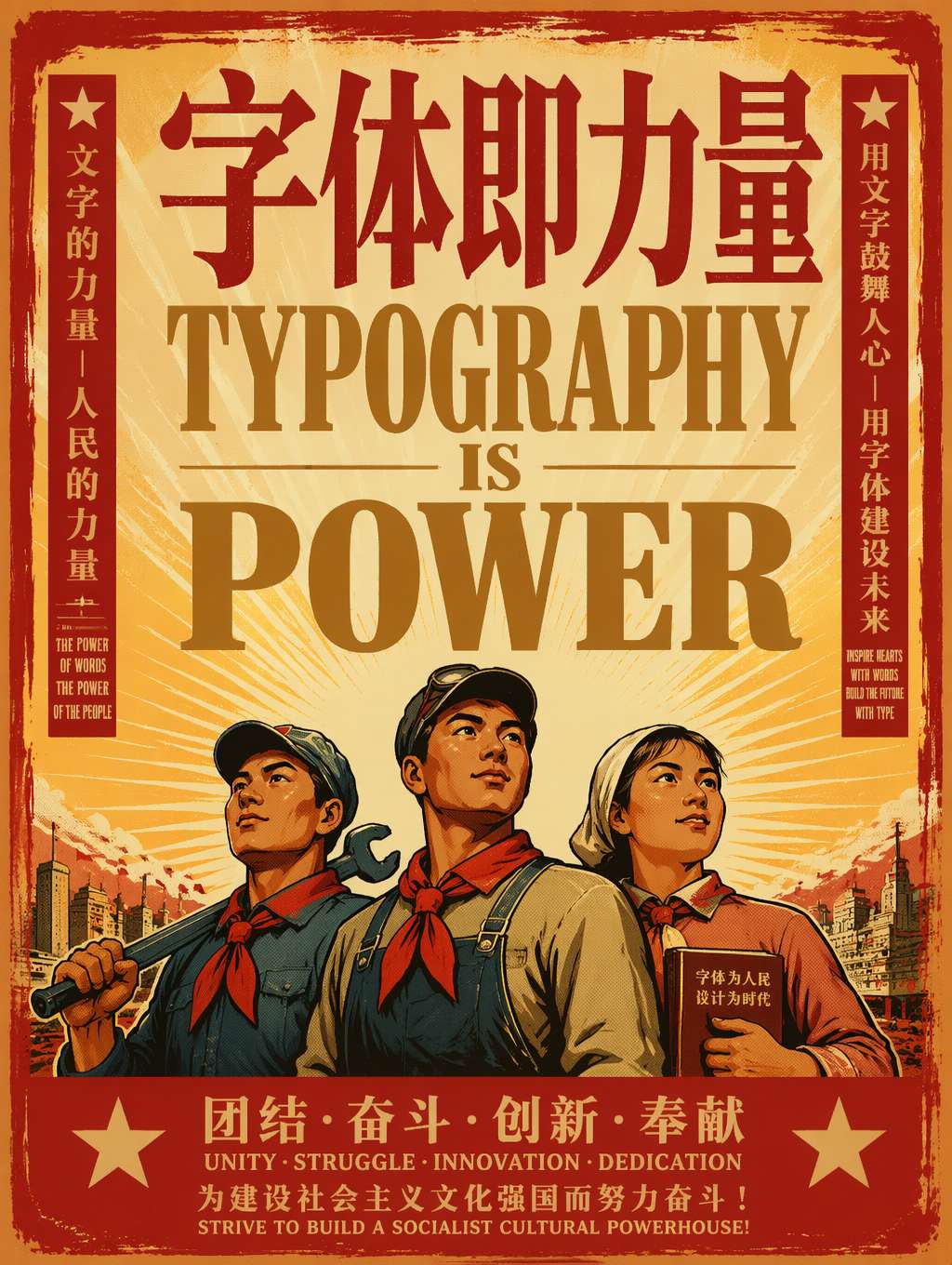 「書体は力なり」——力強い赤金のセリフ大文字+労働者ヒーロー+太陽の光。レトロプロパガンダの定番フォーミュラ。プロンプト改変元:@akokoi1
コミュニティプロンプトテンプレート(@akokoi1):
Generate a 1980s propaganda poster. Use the exact slogan "[your slogan here]". Include [characters], and give [character] a [accessory].
ポイント:
1980s propaganda poster—— 一語でビジュアル系統を確定Use the exact slogan—— 文字内容を正確に指定(GPT Image 2の文字レンダリングが活きる)- 具体的な人物+アクセサリーで物語性を強化
- 配色:赤を主体に金を補色、ベージュ地(赤・黄・黒は1980年代ポスターの象徴)
バリエーション:
- ソビエト構成主義風:
Soviet constructivist posterに置き換え - 中国革命ポスター風:
Chinese revolutionary poster aestheticを追加 - バウハウス風:
1920s Bauhaus poster, geometric sans-serifに置き換え
用途:ノスタルジー系マーケティング、レトロブランド、ポップアートグッズ、Z世代向けレトロコンテンツ
スタイル5:マガジン編集風大文字——ファッション広告のタイポグラフィ主導美学
ファッションやストリートブランド広告の最新トレンド——書体をモデルや商品より前面に押し出して主役にする手法です。
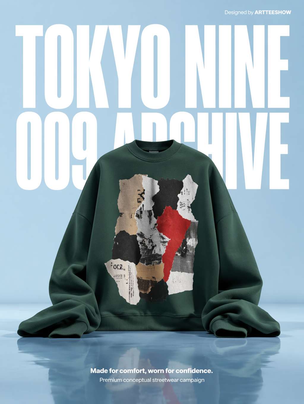 超大の白いコンデンスドサンセリフを背景に、緑のフーディーを彫刻のように主役配置——マガジン風ストリートブランド広告の定番。プロンプト提供:@_LaurentB
コミュニティプロンプト(@_LaurentB、抜粋):
A clean editorial fashion advertisement poster on a pale powder-blue studio background with a glossy reflective floor. The composition is vertical and minimal, dominated by oversized bold white condensed sans-serif typography in the background reading "TOKYO NINE" on the top line and "009 ARCHIVE" below, filling most of the upper half behind the subject. Centered in the lower middle is an oversized [product]. Premium conceptual streetwear campaign aesthetic, crisp studio lighting, surreal scale contrast.
ポイント:
dominated by oversized bold condensed sans-serif typography—— 書体を他の要素の上位に置くcondensed sans-serif—— コンデンスドサンセリフ(編集デザインの真髄)filling most of the upper half behind the subject—— 背景にありながら画面を支配surreal scale contrast—— 書体と商品のシュールなスケール対比
書体用語早見表:
condensed sans-serif= コンデンスドサンセリフ(縦長型)expanded sans-serif= エクスパンデッドサンセリフ(横長型)display serif= ディスプレイセリフ(見出し用大文字)slab serif= スラブセリフ(重厚で安定感)geometric sans= ジオメトリックサンセリフ(ミニマルで理性的)
用途:ストリートブランドのキービジュアル、ファッションEC、スポーツブランド、ルックブック、ストリートスナップ誌
スタイル6:モダン二重露光ポスター——都市・ブランドの上質な表現
書体とビジュアルを「光のリボン/二重露光」で融合させる手法。今もっとも人気のあるハイエンドブランドポスターの形式です。
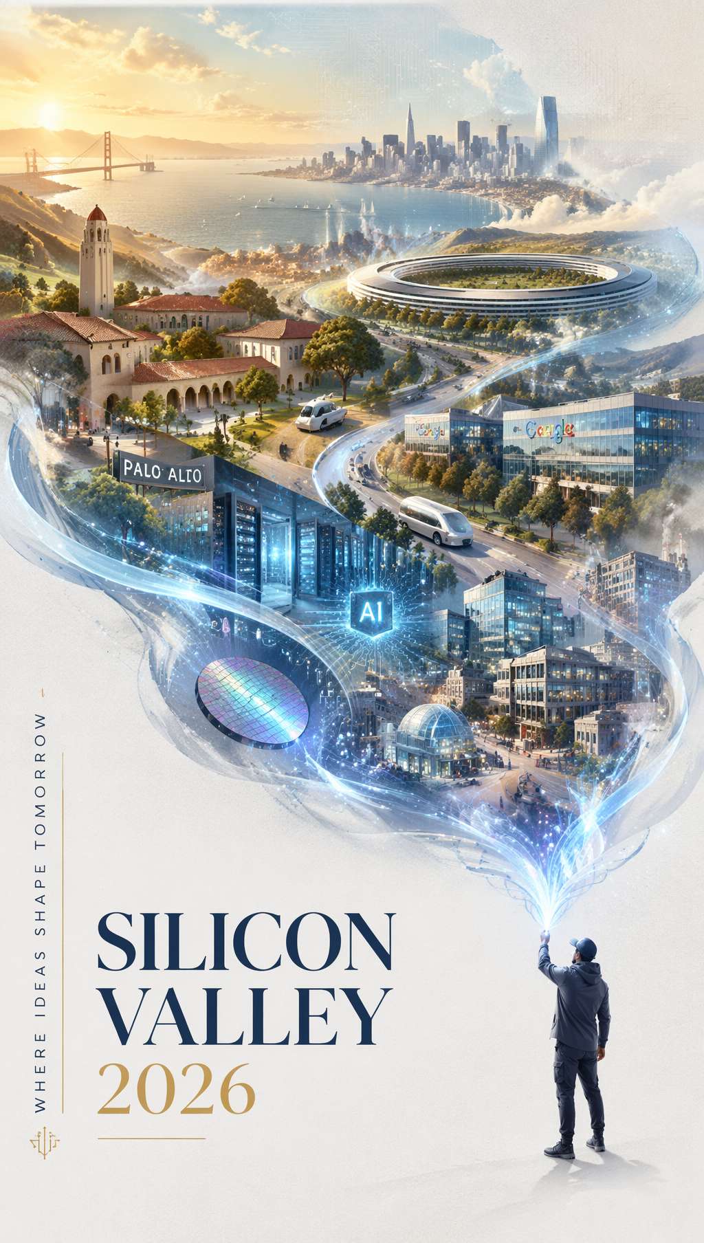 シルバーブルーの光のリボンが画面を流れ、シリコンバレーの地図と建築へと姿を変える——「SILICON VALLEY 2026」の優雅なタイポグラフィで締めくくる。プロンプト提供:@carsonyungos
コミュニティプロンプト(@carsonyungos、抜粋):
A refined city promotional poster with a futuristic yet elegant atmosphere. Double exposure composition, preserving an S-shaped sense of flowing movement. On a pure white textured background, a miniature figure releases a long ribbon of luminous silver-blue light. The ribbon flows gracefully through the air, and as it drifts, it magically transforms into a grand landscape blending [city elements]. In the lower-left corner, elegant typography reads "[CITY NAME 2026]" with a vertical promotional slogan: "[your slogan]". Beautiful editorial layout, graceful spacing, clear and complete lettering, premium city branding poster, cinematic lighting.
ポイント:
Double exposure composition—— 二重露光(光のリボン+風景の重なり)S-shaped sense of flowing movement—— S字型の流動構図(画面に呼吸を生む)elegant typography in the lower-left corner—— 文字を隅に控えめに、優雅で出しゃばらないclear and complete lettering—— 文字をくっきり完全に(AIの文字欠けを防ぐ)
汎用置換変数:
- 都市:
Silicon Valley→Tokyo/Shanghai/New York - テーマ:
technology and innovation→art and culture/nature and wellness - トーン:
silver-blue→gold-amber/rose-pink
用途:都市観光プロモーション、ブランド年次報告書の表紙、テック企業のキービジュアル、ラグジュアリーブランドポスター
タイポグラフィプロンプトの万能テンプレート
上記6つのスタイルを抽象化すると、汎用テンプレートが見えてきます:
[風格定位] poster with [整体氛围].
[構図方式] composition with [関鍵視覚機制].
[Background description].
TYPOGRAPHY: [字体類型] reading "[exact text]",
positioned [位置描述], with [字体処理方式like distortion/material/color].
SUBJECT: [次要主体描述].
COLORS: [主色] + [輔色], [整体色調風格].
STYLE: [風格関鍵詞], [質感関鍵詞], [完成度関鍵詞].
書体処理キーワード早見表:
| 求める効果 | プロンプトキーワード |
|---|---|
| 文字が表面に沿って変形 | letterforms conforming to surface curvature |
| 文字が物理的にシーンに溶け込む | surface-integrated not floating |
| 書体が背景として支配的 | dominated by oversized typography in the background |
| 文字のマテリアル化 | letters constructed from [material] texture |
| 文字が遮られる奥行き感 | partially occluded by foreground elements |
| 極端な遠近収縮 | extreme perspective distortion aligned to vanishing point |
| 文字とイメージの融合 | double exposure composition |
| 書体を主役に据える | typography as the hero element of the composition |
おわりに
AIによるタイポグラフィポスター生成が最も役立つのはどんな場面でしょうか。
- コンセプト探索段階:3分で5つのスタイルを試し、ブランドの方向性を見つける
- 予算が限られたスタートアップブランド:デザイナーに依頼する余裕がない時、AIで初版を作る
- SNSの毎日更新:日替わりのテーマポスターを、手動組版より10倍速く
- デザイナーの補助:AIでレイアウトの着想を得て、Figma/Photoshopで仕上げる
AIに頼らない方が良い場面:
- 大手ブランドのコアVI(やはり専門の書体デザイナーが必要)
- 複雑な書体ライセンスが絡む商用案件
- A2を超える印刷物(AI出力の解像度には限界があります)
とはいえコンテンツクリエイター、独立系デザイナー、小規模チームにとって、AIタイポグラフィポスターは現時点で最速の「コンセプトから完成品へ」の道筋です。この6つのプロンプトを保存しておき、ポスターが必要な時にそのまま流用してみてください。あとはGPT Image 2に任せましょう。
プロンプト出典
- EvoLinkAI Prompt Library —— ポスター事例を毎日更新
- awesome-gpt-image —— X(旧Twitter)で人気の書体デザインプロンプト
Written with pixocto · Images generated by GPT Image 2